20th Century- Harry Beck’s Tube Map 1933.
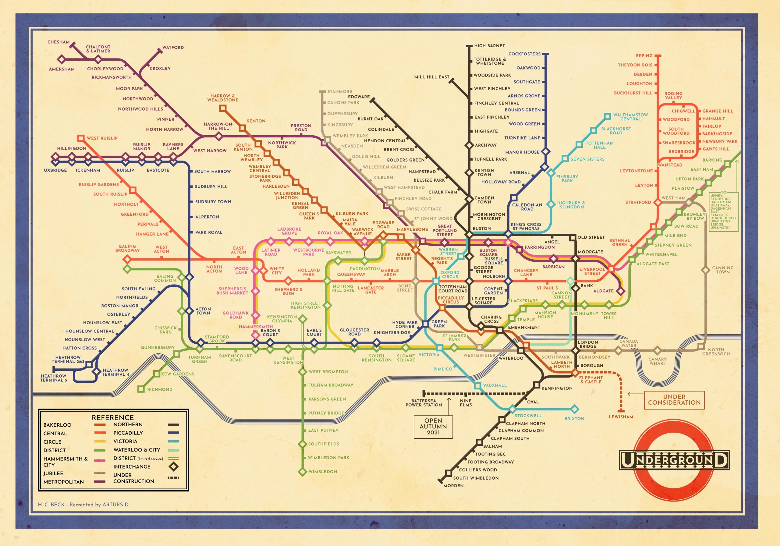
What is now recognised around the world the map of the tube was created back in 1933 by Harry Beck. Rather than a traditional map emphasising on distance and geographical accuracies, Beck’s map was based on circuit diagrams he drew for his day job, separating the large tube network down to a neat and simple diagram of coloured crossing lines.
To begin with Beck’s map was rejected by the publicity department as they felt it was too radical of a design however, a trial print was run and was a success and was just what the public wanted. The public loved it as it is a clear and comprehensible chart, so much so that it was a map that was adopted by transport systems around the world for similar situations in cities such as New York, Tokyo and Paris. Beck’s design influenced the rise of abstract data visualisation and system design and set a precedent for clarity and user-centric thinking in everything from metro maps to software interfaces.
Key factors that made the design a success:
-Prioritised user needs: Beck understood that when a passenger entered the tube they wanted to know the order of the stations, where they are currently and when to get off, not the geographical values such as distance between them.
-Diagram Approach: The map Beck created completely removed the complex chaotic geography of London and turned it into a clean, diagrammatic, and easy-to-read, schematic design.
-Use of colour: The use of distinct, bold and colour coded straight lines made individual lines easy to follow.
-Readability: The central, dense part of the network was enlarged, while outlying areas were compressed, making the entire map easier to read by creating a typographical hierarchy.
This design was so influential that it has survived the test of time as it is a design that is still adopted to this day and used all around the world, and has become an instantly recognisable and iconic image of London and The Underground.
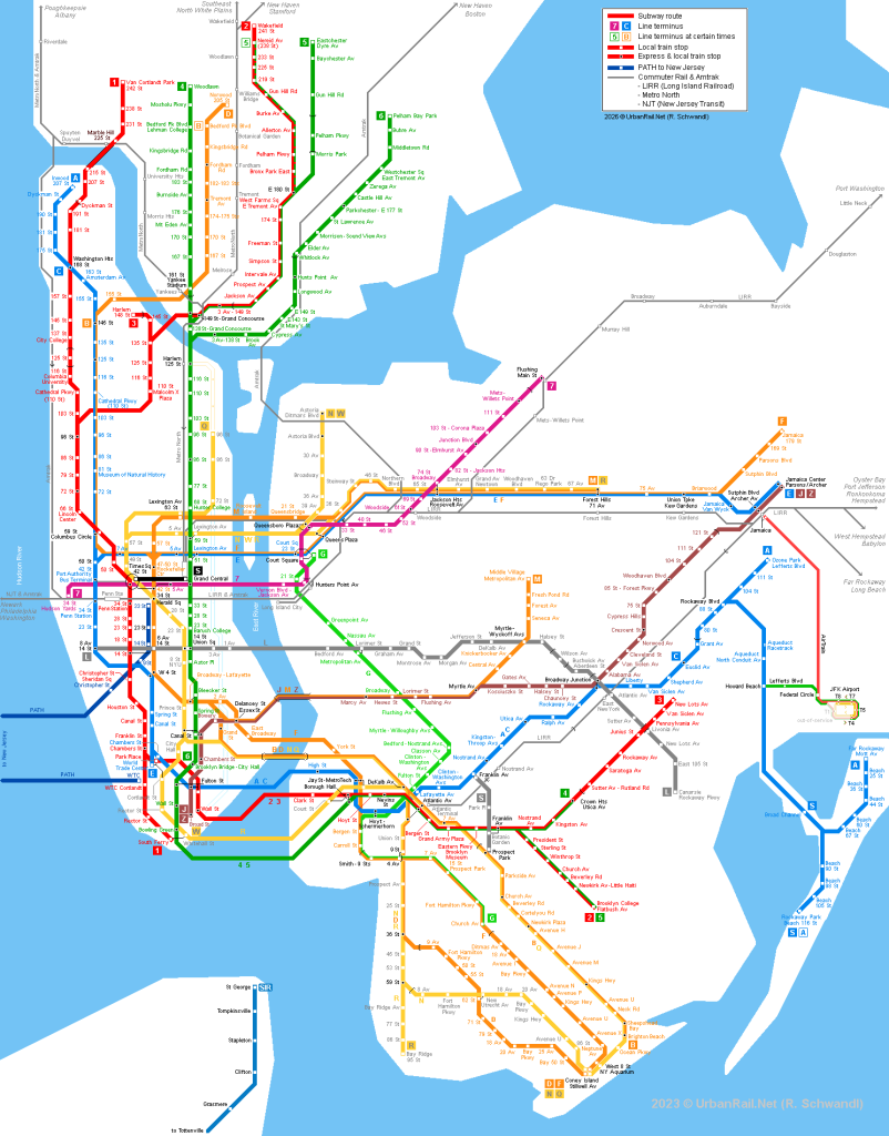
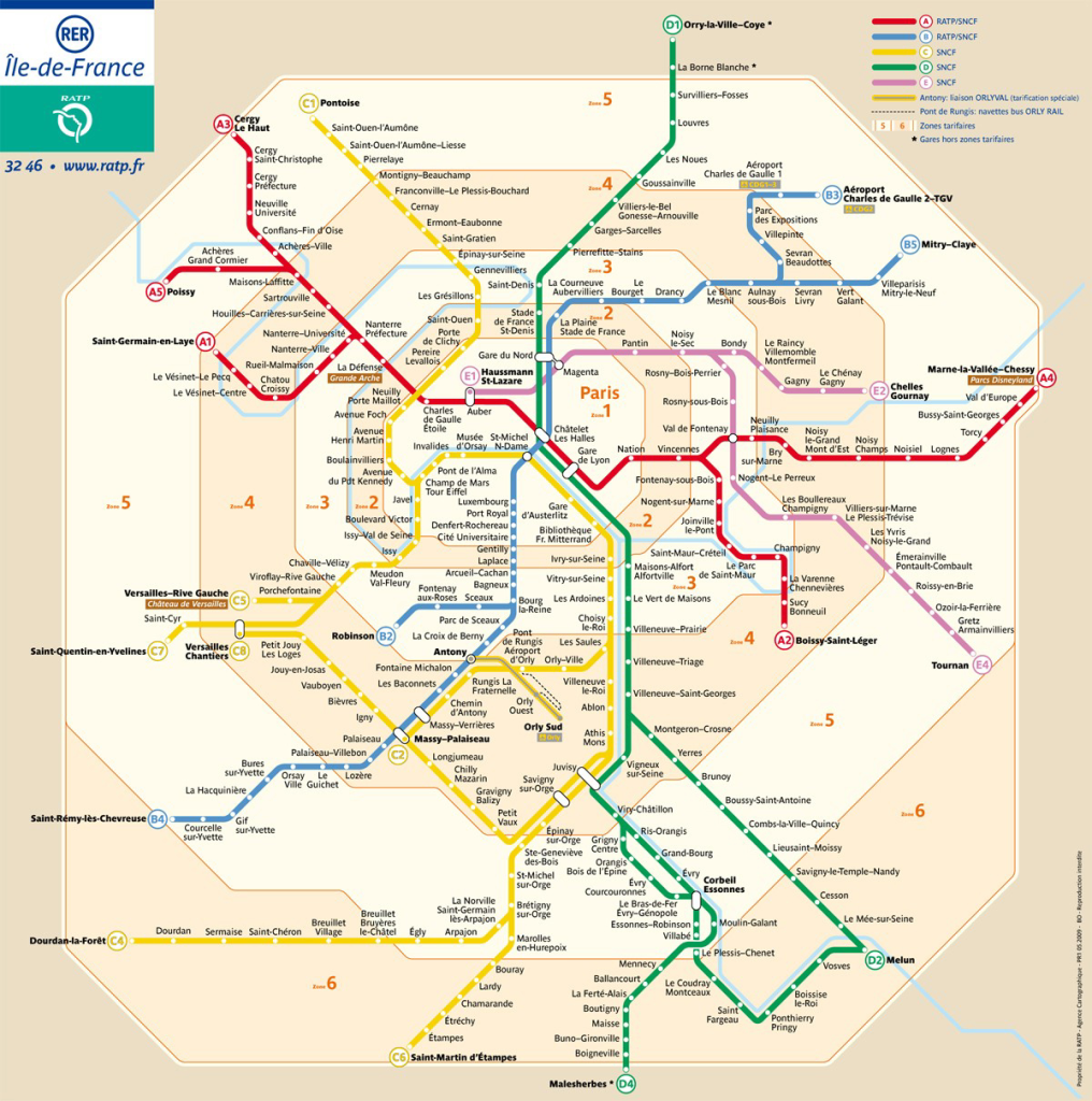
Above are examples of how Beck’s design has influenced other metro stations/ systems around the world and how they display their maps almost identical to the way Beck did all the way back in 1933.
Contemporary: Life Factory
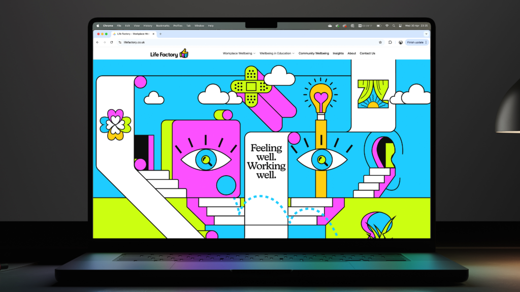
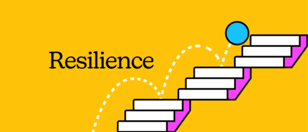
This landing page for the website and company “Life Factory” is a great example of how design can influence good and societal impact.
Firstly the colours of the design are all nice on the eye and vibrant which immediately gives the site a sense of energy and the colours are all positive and friendly which also helps it feel more welcoming too.
The site also shows how the use of iconography can make an impact too, for example, the site has numerous icons of things such as bandaids, eyes and ears which helps show whoever is viewing the site that it is a place where they can feel safe and protected. The overall design is also bold and up-beat due to all these colours and icons put together.
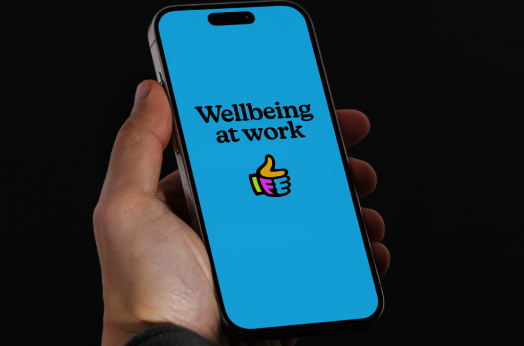
The typeface used also can make an impact. In this case the typeface used is more of a “quieter” typeface and not loud and bold which again helps the site feel a bit more friendly and welcoming.
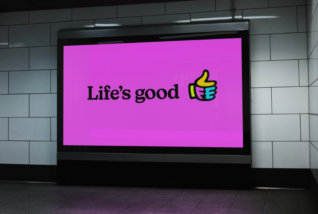
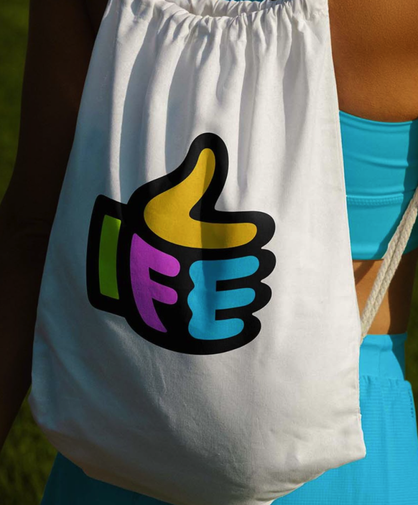
When it comes to the logo design it has been designed in a bold, striking manner whilst also been quite simple. The logo has been formed in the shape of a thumbs up which again shows the companies up- beat and friendly vales whilst also integrating the word “life” within the thumbs up which again adds an extra layer of creativity and meaning.
The thumbs up icon also helps nod to the attitude to helping people and creating again a friendly and welcoming company. The overall design is confident and emotionally intelligent and the visual design system is colourful, energised and full of character which has been done to challenge and create a stark contrast to the typical sterile, dull and data- heavy design often seen within the health and well being design world.
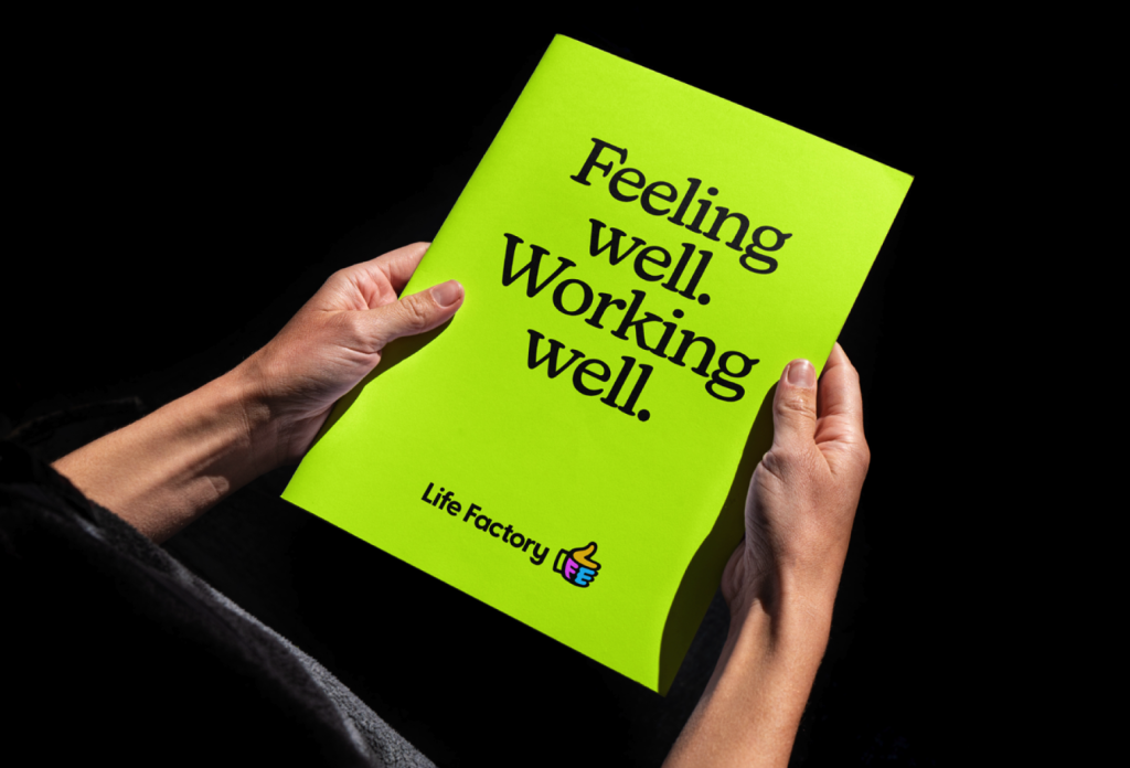
The company also showcases how design can help spread positive messages, emotion, feeling and so on by placing messages and pieces of text within their design again using the friendly and calm looking font. Below is also examples of how design can further have an impact by incorporating their designs into merch which can help the brand reach a wider audience and further spread their cause and impact to the wider public.
The site also features illustrations throughout which again help support the brands tone of voice as they are playful which help create a sense of lightness and empathy to delicate subjects areas that may carry a stigma or discomfort.
Overall, this design is welcoming, bold and eye catching with the pleasant vivid use of colour and iconography, this is something that I would like to incorporate within my project.
Reference list:
Harry Beck’s Original London Underground Map… But With 2020’s Tube Network (2026) Londonist [Online] Available at:https://londonist.com/london/transport/modern-tube-map-harry-beck-1931-1933
NEW YORK CITY (2026) UrbanRail [Online] Available at:https://www.urbanrail.net/am/nyrk/new-york.htm
Paris metro map. Paris metro map pdf (2026) parisdigest [Online] Available at:https://www.parisdigest.com/information/mapmetro.htm
Life Factory (2026) LifeFactory [Online] Available at:https://www.lifefactory.co.uk