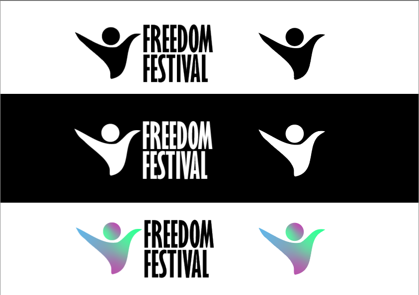
The Freedom Festival is an event that is packed with lots of energy with people expressing themselves and able to celebrate with the people of Hull. I felt the current design for the Freedom Festival lacked this for a number of reasons. Firstly, I felt the current logo design was quite child like which may affect its ability to reach the right audience, this is due to the blocky appearance of the logo and looks as though it was made of some sort of building block by a child, this can also make the logo quite illegible to some and may struggle to read what it is saying. For my redesign of the logo I wanted to create a logo that had an icon apart of it too so that it could be used without the text so that it could be used within things such as social media profile pictures and so on, which is something that can’t really be done with the current design. Secondly, the current logo seemed a bit dated due to it just been a solid block colour and so within my design I wanted to create a logo that had multiple bright and vivid colours within to give off a feeling of energy within it, the icon is supposed to be a person waving their arms in the air, as typically when someone expresses themself as “Free” they would typically wave their arms in the air. My logo has three different versions, one with the colour, one for a darker background and one for a lighter background, this is done to make the logo more accessible and be able to use in all circumstances.
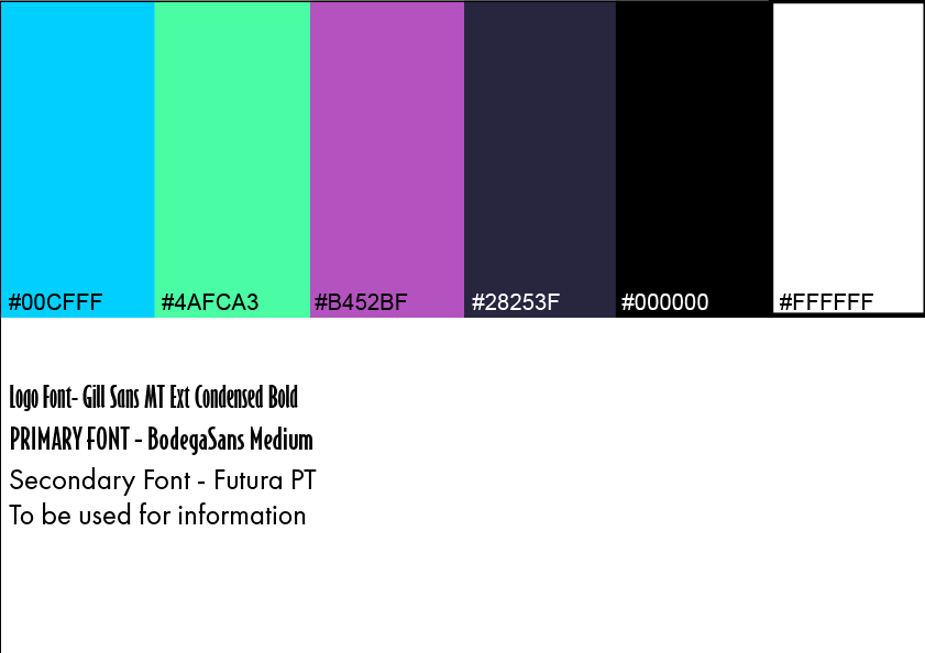
When it came to choosing a font for both the logo and website/ app I chose the three fonts above. For the logo I decided to use the font I did as it is bold and sans serif making it more loud and easy to read, I also felt choosing a serif font would maybe look too over the top and a bit more fancy which may give people that the event is a more rich/ fancy one which isn’t what I want. For the website I chose to use a serif font for the headings as it is bold and also looks a bit more artistic and free which links to the theme of freedom and then for the information I chose a simple sans serif font that is simple can and easy to read at almost any size making it accessible to use.
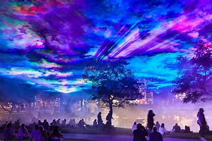
The image above also features heavily throughout my design as I feel it best captures the emotion and energy that can be felt throughout the event due to its bright and vivid colours that can be seen within the sky and is used quite a lot throughout the campaign as combined with white text creates a nice contrast and creates a pleasing background.
For the colour palette I grabbed the colours from the image above as again the bright vivid colours that can be found within are vital to my design and then I picked out a darker colour for the background of the website and app and also other things such as posters and email.
Throughout the brand I have used phrases such as “This is Hull” to further solidify that the event takes place in Hull and to also celebrate that fact and show the event is about the people of Hull coming together and having a festival to celebrate.