My website and app are now at a point where they can be put together into a prototype and doing this has shown me a number of things that needed to be changed within my design.
The website prototype had a number of aspects wrong with it which I then changed before making the mobile version of my Freedom Festival app so that I didn’t have to spend more time changing that too, however when viewing the mobile version using the Adobe XD app on my phone I noticed they were a number of things wrong with that too.
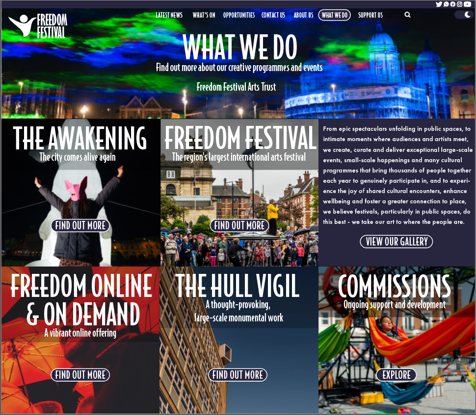
In my early designs I noticed a few things wrong with my design and also received similar feedback with the same thoughts, firstly the initial design was way too compact and looked as though it was just crammed together this is something that needed to be changed urgently as something like this can cause the user to become very overwhelmed at what they are looking at and they wouldn’t really know where to look as there is so much going on in each page they visit. Also the ‘What We Do’ page was very wordy and didn’t really need the text in the places where it was, for example the text that was placed in the gallery section didn’t need to be there, for example, it could be placed in the page that clicking the gallery tab would take you to and so I decided to remove it completely.
Another thing that was lacking in my initial prototype was the hierarchy of text, having a hierarchy is important as it indicates to the user what is the more important pieces of information they need to read first helping them to see what each page is about and how to navigate around the site. On the ‘What We Do’ page the hierarchy was poor as the headings of the categories were the same size as the main heading of the page which shouldn’t be the case as they are sub categories and so made the text significantly smaller in order to create a more clear hierarchy of text.
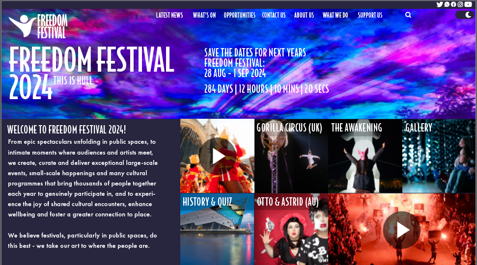
The positioning of text in some pages were quite poorly done also which can also effect the hierarchy for example, on the home page the header was positioned to the left whilst the count down was positioned in the centre, this didn’t really work well and looked as though it had just been thrown onto the page, to fix this I positioned the header of all my pages in the centre, which is something else I needed to change as the positions of headers on some pages were in different positions which made could make it confusing for the user. I’ve added below some screenshots of these pages to show how I have countered these issues.
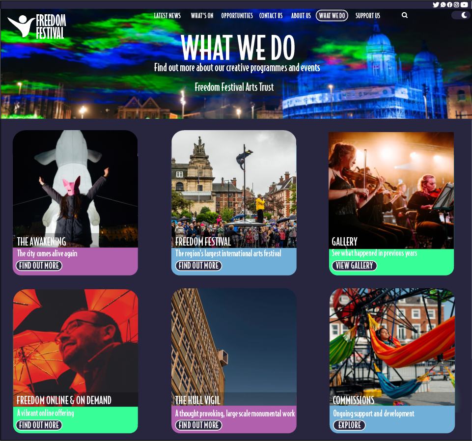
As you can see to fix the issue to fix the cluttered look I have shrunk each tile and given them their own space creating a nice white space and created a card design for each tile which is featured throughout my web and app designs to create a sense of familiarity and consistency, which should help the user learn the web and app all the more easier. Originally also some pages of my design featured squared edges and some rounded i decided to change them all to rounded throughout to again create consistency throughout.
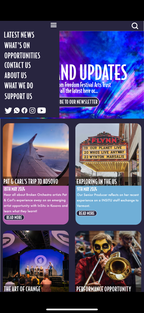
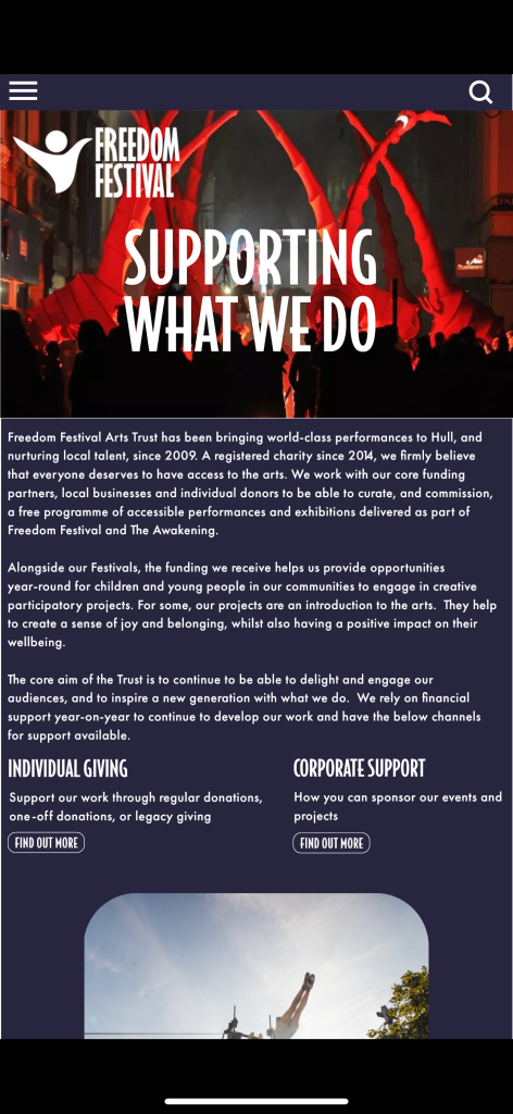
As my app design were created after I made the changes to my web design they weren’t as much things I needed to change, however when checking the prototype of my phone I noticed a few tiny details that needed tweaking, for example in the above photo the menu is supposed to stretch all the way to the bottom of the photo behind the header however on a few pages it was a bit too short and could see slight pieces of the photo underneath.
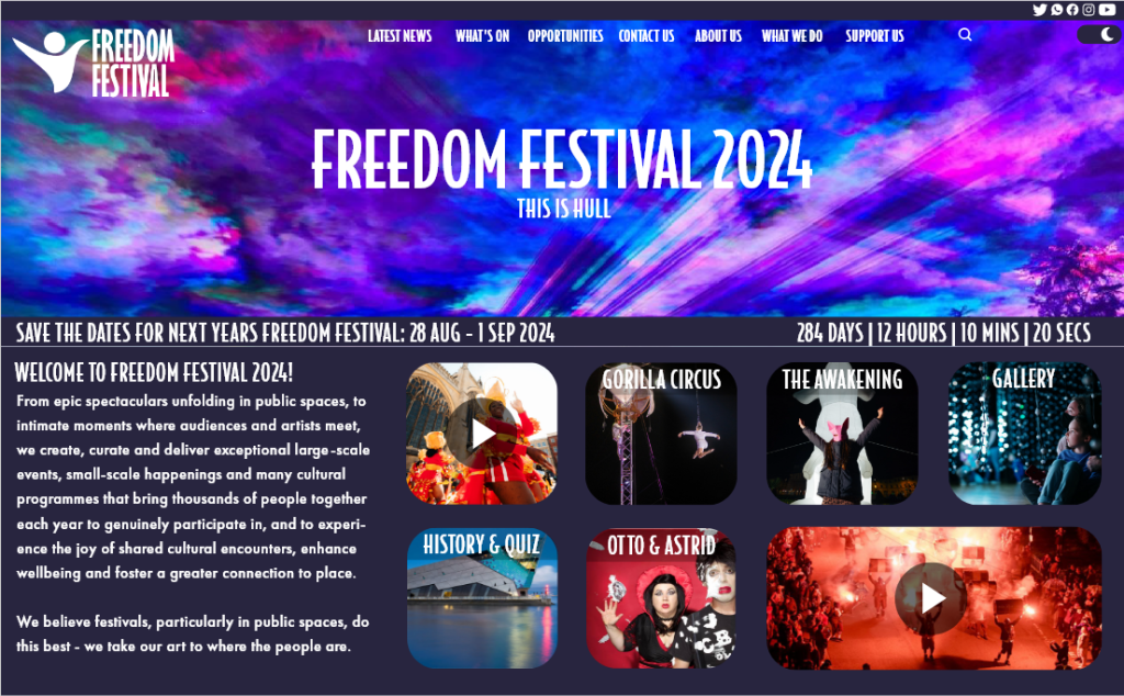
On the photo below I have tried to show how the background purple blocks were too short and were leaving white edges around the screen however this cant really be seen due to the background of this site been white but this was something I made sure to change.