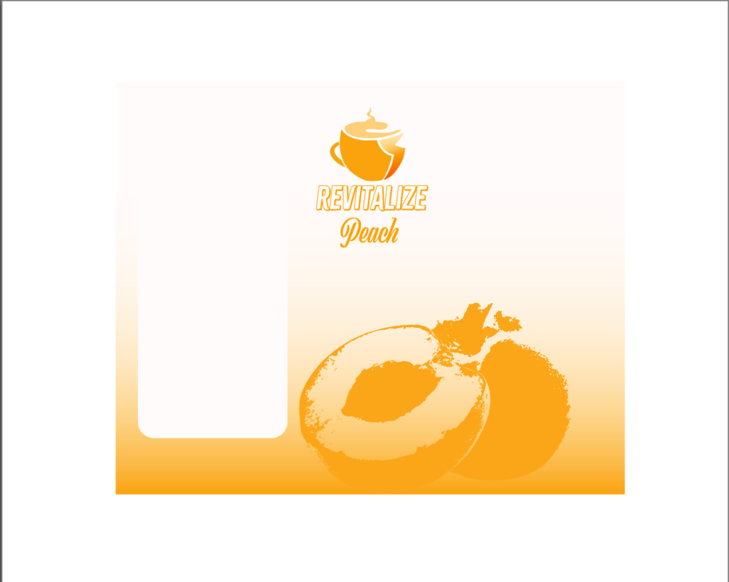
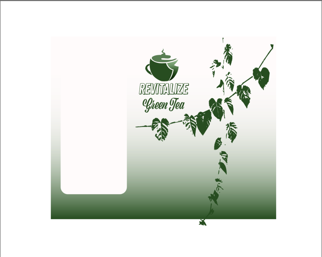
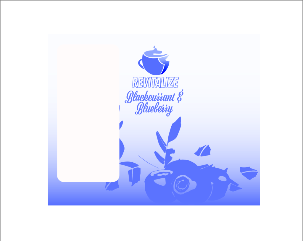
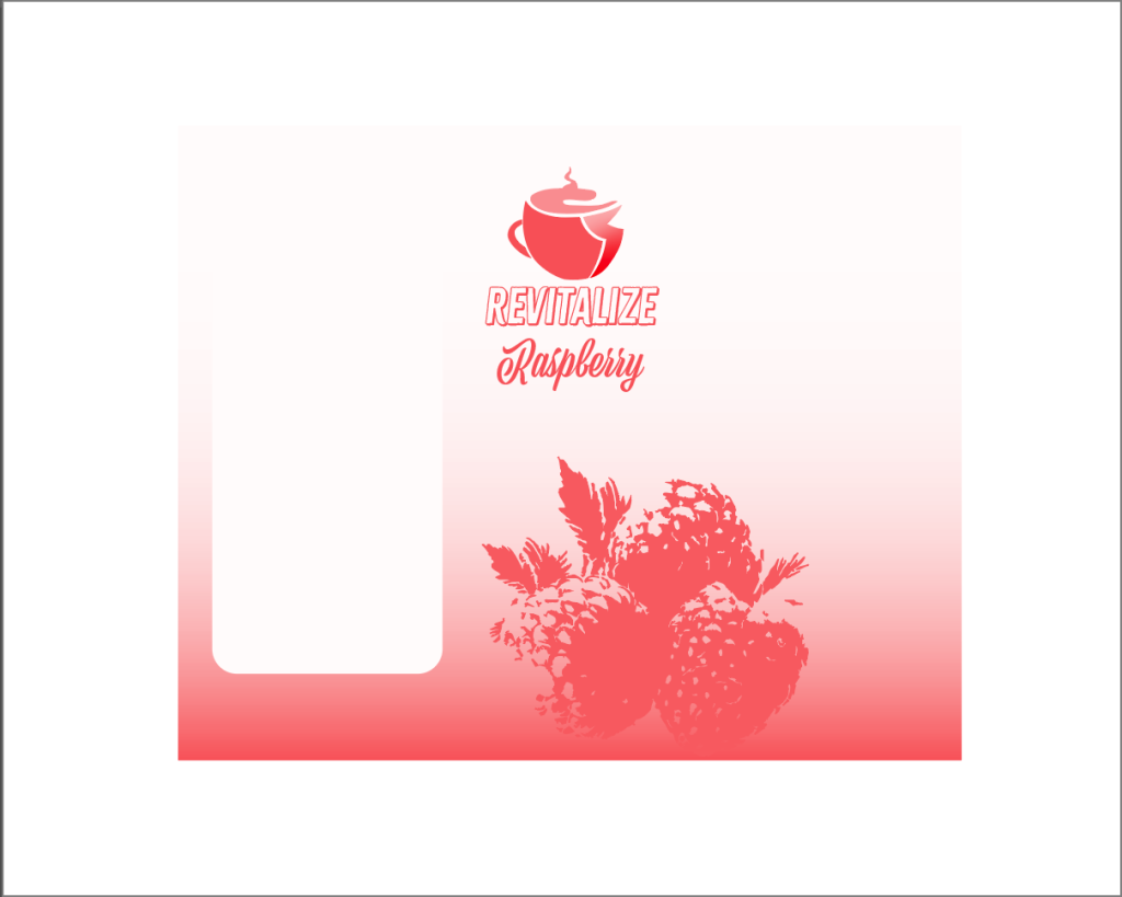
When it came to designing and creating the packaging design for my energy drink I began by creating a quick and simple thumbnail image for the can to allow me to create quick designs so that I can experiment with how I want the final outcome to look. My idea was to create a few designs as I wanted to have multiple flavours for my energy drink and wanted each flavour to have its own separate design so that they can be easily separated and recognised from one another. I researched popular tea flavours and chose four popular flavours that are typically liked by older people and chose them as the flavours for my energy drink, the flavours I chose are: raspberry, peach, blackcurrant & blueberry and green tea. Then for each flavour I coloured each design similar to the flavour and vectorised some images of each flavour and included them within the design so that each can again is easy to recognise and separate from each other. I decided to have the design and flavours based on different flavours of tea as it is something that is heavily liked by the over 60s and so if they were to see the can and packaging design it may increase the likely hood of them buying as it’s something they would like. For the font of the flavour used on the packaging I decided to use a different font to make the logo and the name of the flavour be easily separated from one another keeping it easy and clear to read and used the italic font to make the can look more fancy.
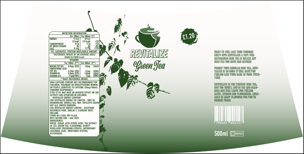
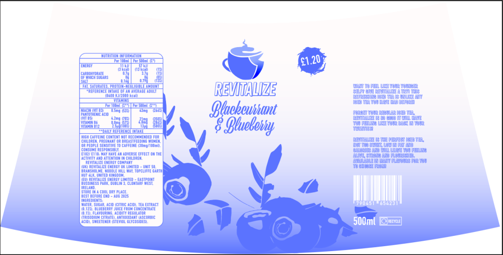
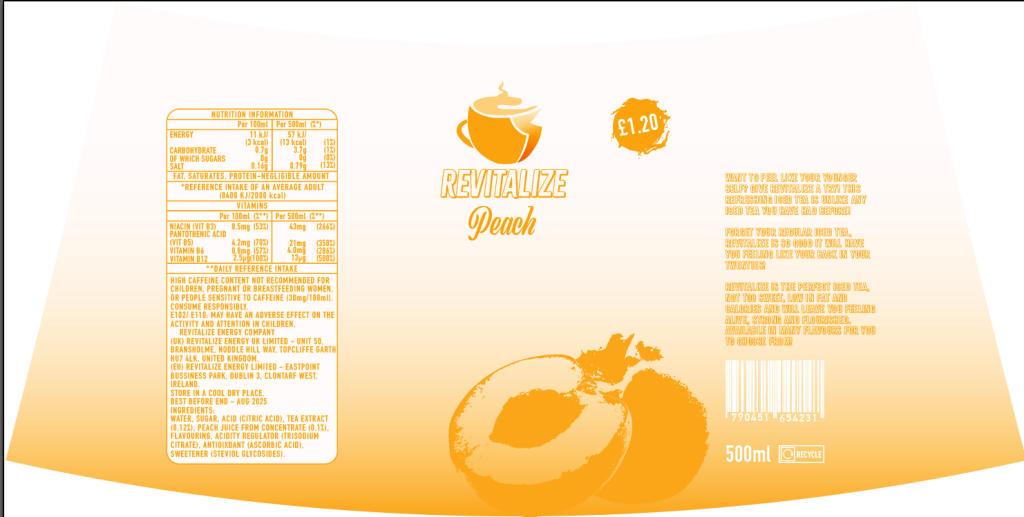
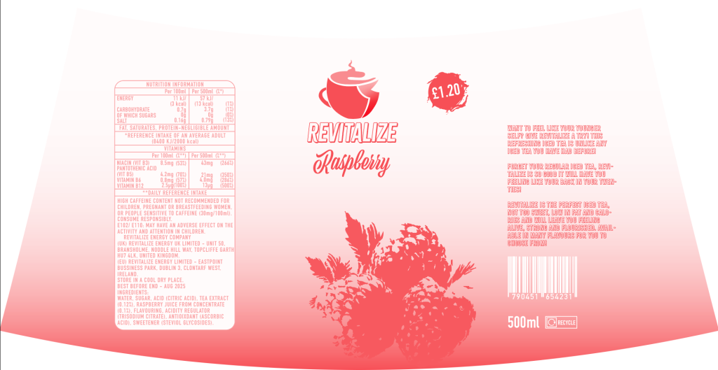
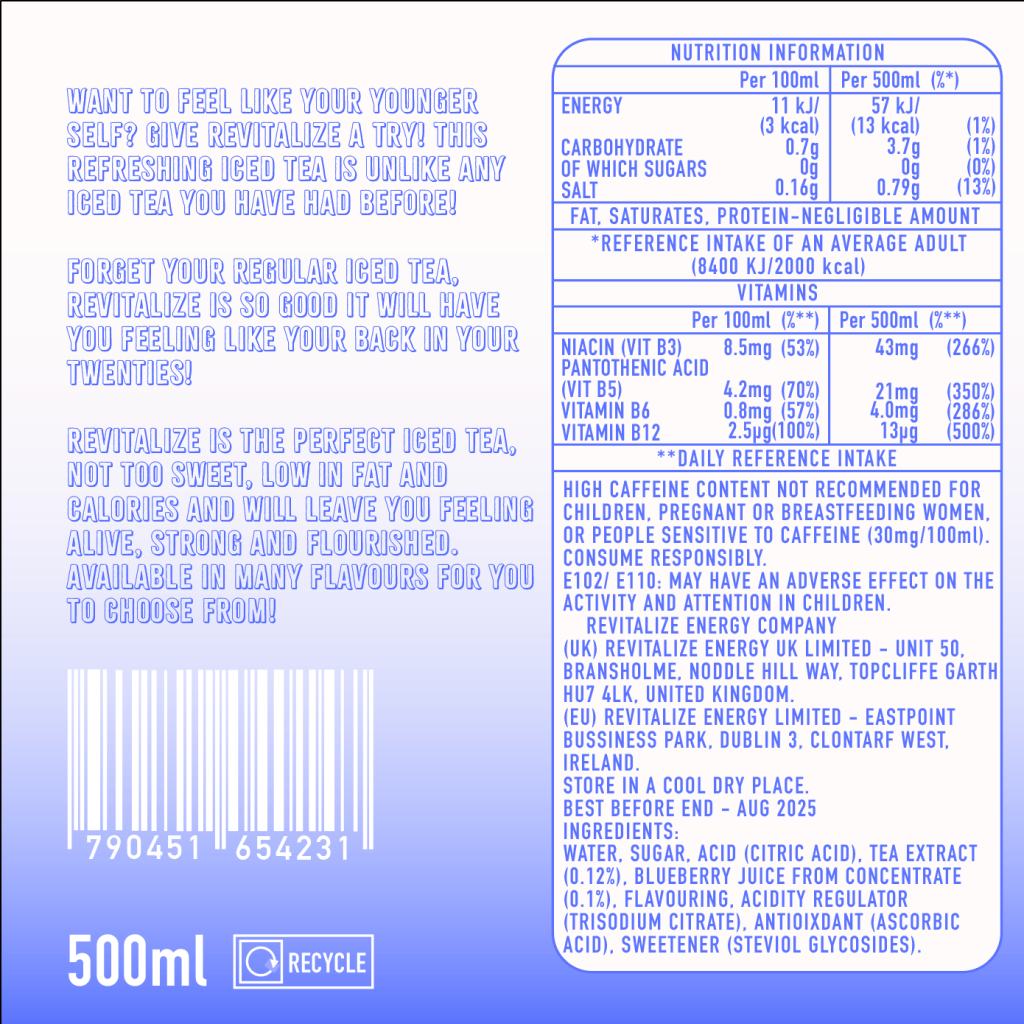
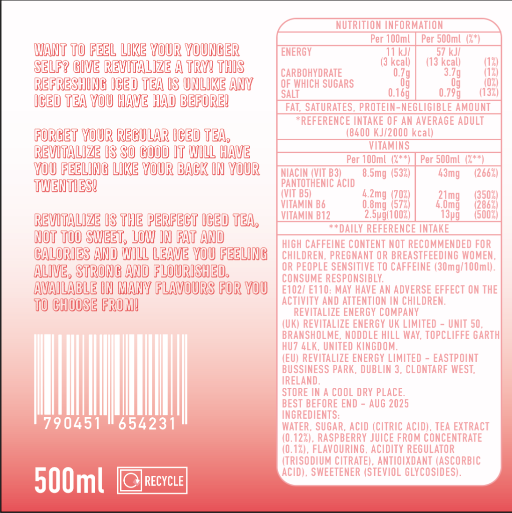
Once I had the basic layout for how I wanted each of the packaging for the flavours to look I began designing the the design for the whole of the can and adding in the mandatory information on the can and packaging such as the list of ingredients, net quantity information, any necessary warnings and so on. I then created my own barcode and placed it on the final design to make to product look more authentic and other little details such as the recycle logo and the size of the drink. I also warped the background so that it fit around the can properly when importing the graphic into substance stager. I also wrote a little message on the side of the can as it is something that you can find on a lot of energy drinks or just any sort of canned drink in general and so decided to include one within my design to again make my design look as close to a real product as possible. The message I added was also added to tell the target audience (over 60s) of how the energy drink will leave them feeling when they drink the energy drink.
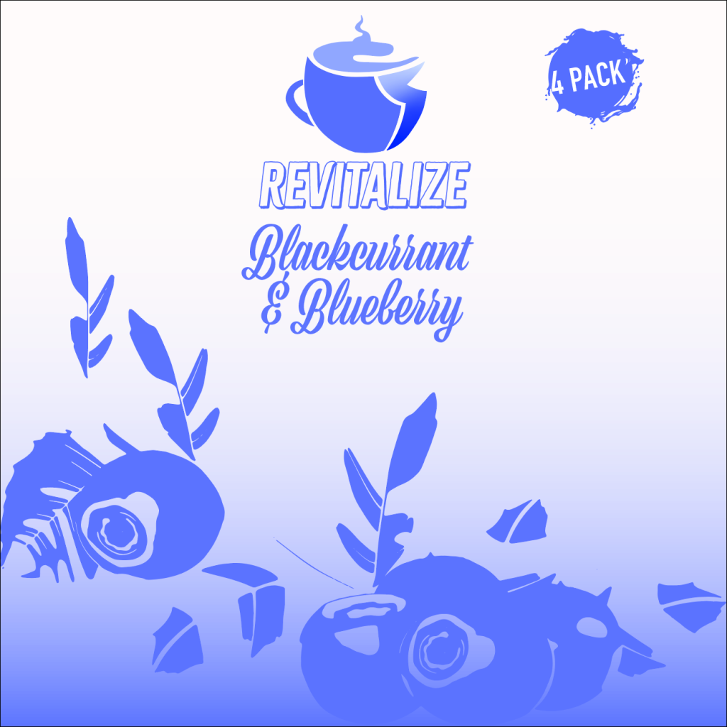
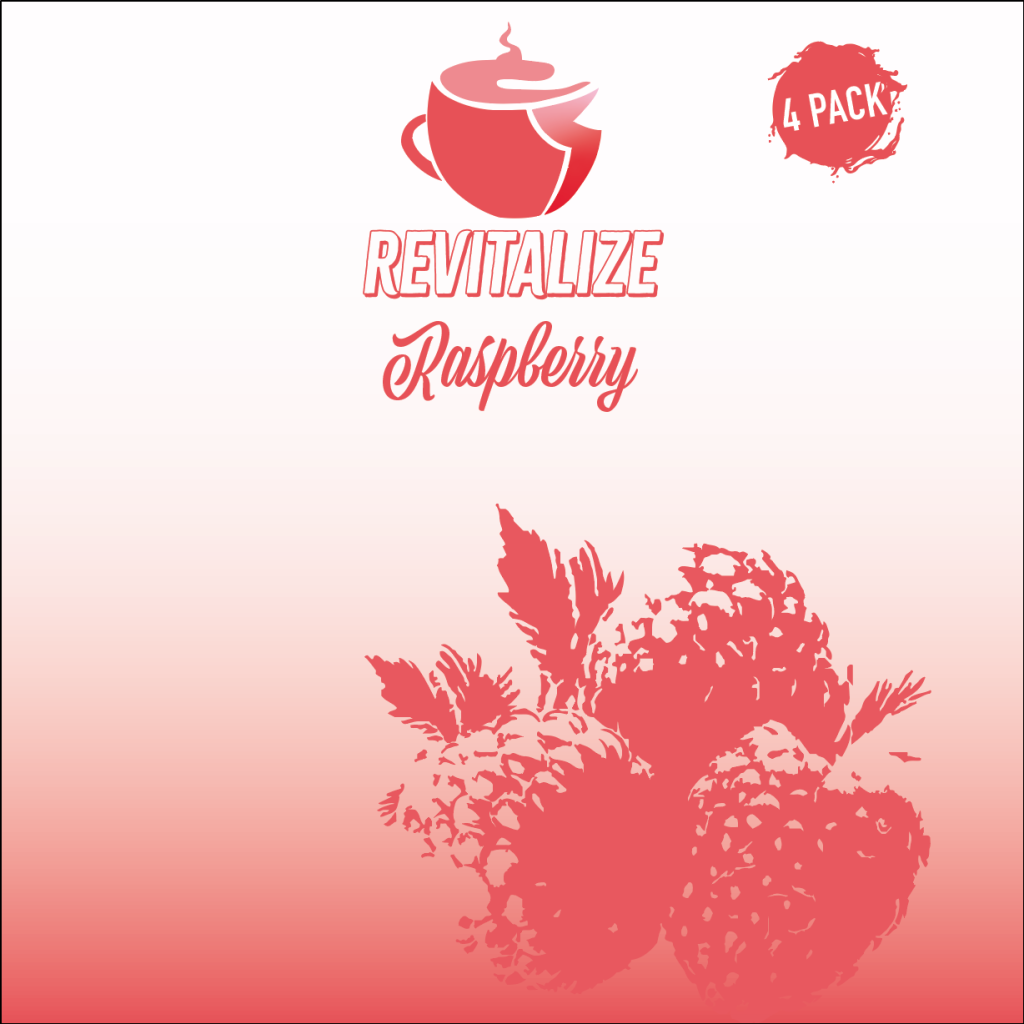
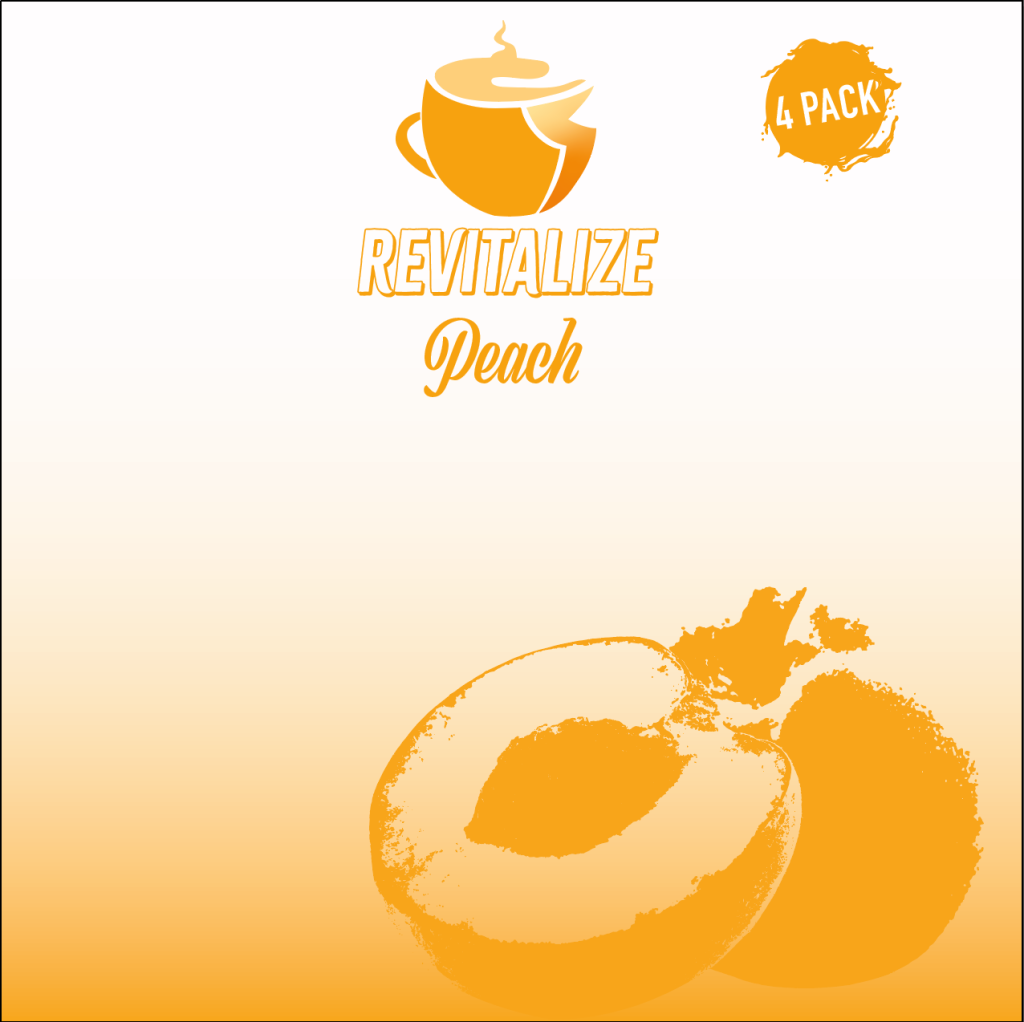


Something that I wanted to have in my final animation was a 4 pack packaging for my cans to fit into and this was something I also had to design, I created a front and side again for each flavour and placing the information again on this packaging so that it is all still there if someone can’t see a can. This idea was inspired by Monster Energy and how they sell their cans in boxes of four.
My overall design for the can and the box I wanted to be quite simple but still nice to the eye as having a design that is too loud and filled with graphic and images can be quite overwhelming for an older person and would mean they wouldn’t bother to look at the product, this design been more calm on the eyes would stop that from happening and is something they would prefer to look at and potentially buy.

Links for images used:
Raspberry: https://www.pinterest.co.uk/pin/845621267555592819/
Leaf: https://www.vecteezy.com/png/26690641-hanging-plants-with-the-shape-of-heart-leaves-element
Peach: https://pngfre.com/peach-png/peach-png-image-from-pngfre-33/
Blueberry: https://www.pinterest.co.uk/pin/1115133557714219465/