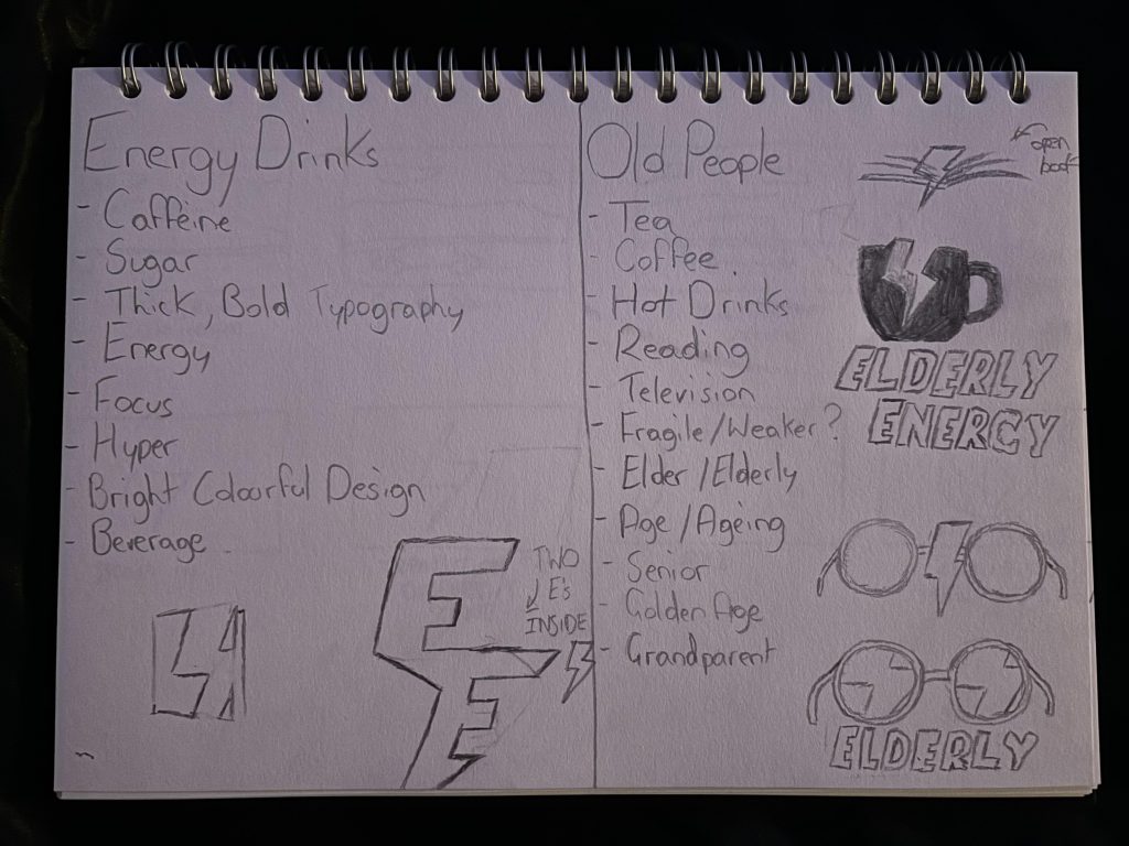
When it came to starting the create my logo for my energy drink I started by creating a page that was split in two with “Energy Drink” on one side and “Old People” on the other and then listing words or anything that could be related to them. Once I had a few words down I began creating quick and rough sketches of logos by combining something from the energy drink side and the old people side and some ideas for a conceptual logo. The route and logo that I decided to choose and expand on was the one involving the tea mug and energy symbol as I felt tea or coffee is something that is liked heavily by older people and is something that I could expand more on in my whole brand.
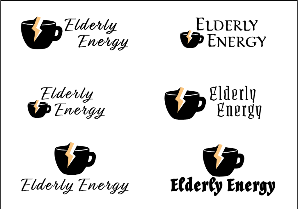
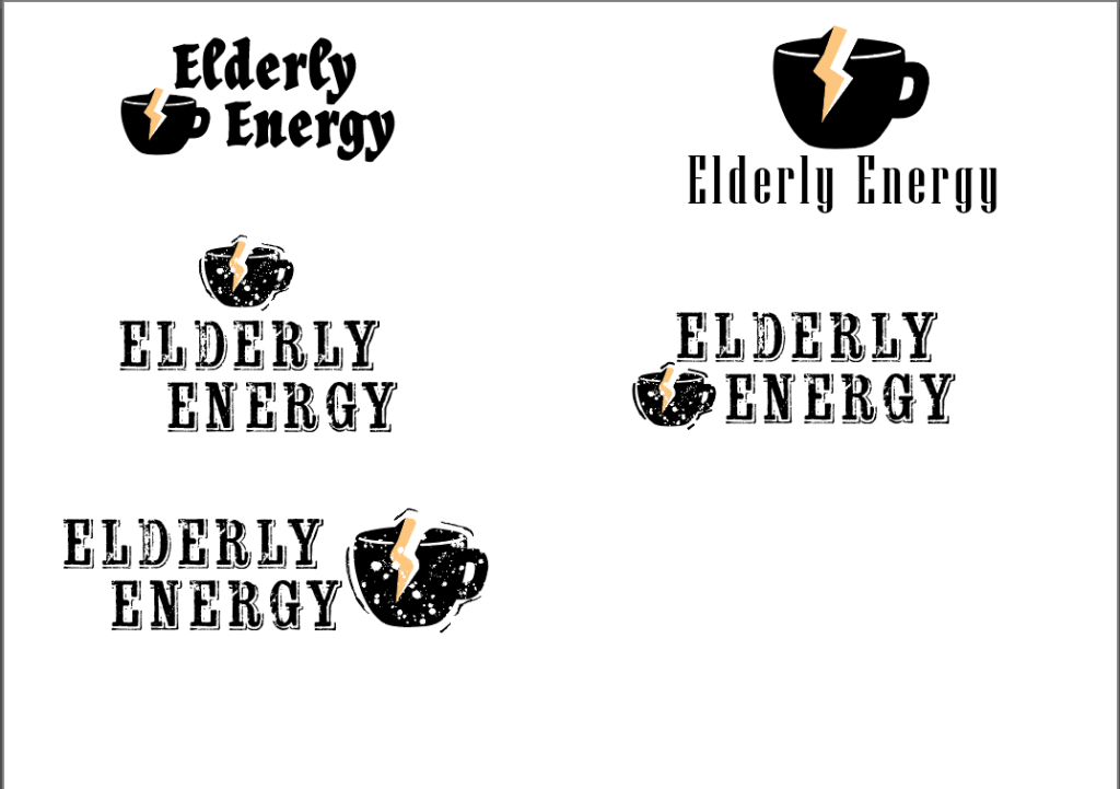
Once I had an idea of what I wanted my logo to look like I took my sketch and made a few logos on Illustrator and played with a few fonts as I wasn’t sure what look I wanted to go for. My original idea for my logo and brand was for it to be called “Elderly Energy” and I was going to go for a more old fashioned/ old schooled look and design. These first designs (above images) however I never found myself liking them no matter what font I paired the logo with and also tried to add a few more details and decoration and still didn’t like it as to me the logo looked a bit basic and flat looking. Furthermore, I had visited my grandparents one weekend and showed them the initial logo design and asked them if they would find the name “Elderly Energy” offensive which they both responded that some older people might and so I decided to go for a completely different approach with the same tea cup concept having that feedback from someone who is older helped fortify the decision to change as I didn’t want my logo/ brand to be viewed negatively by some.
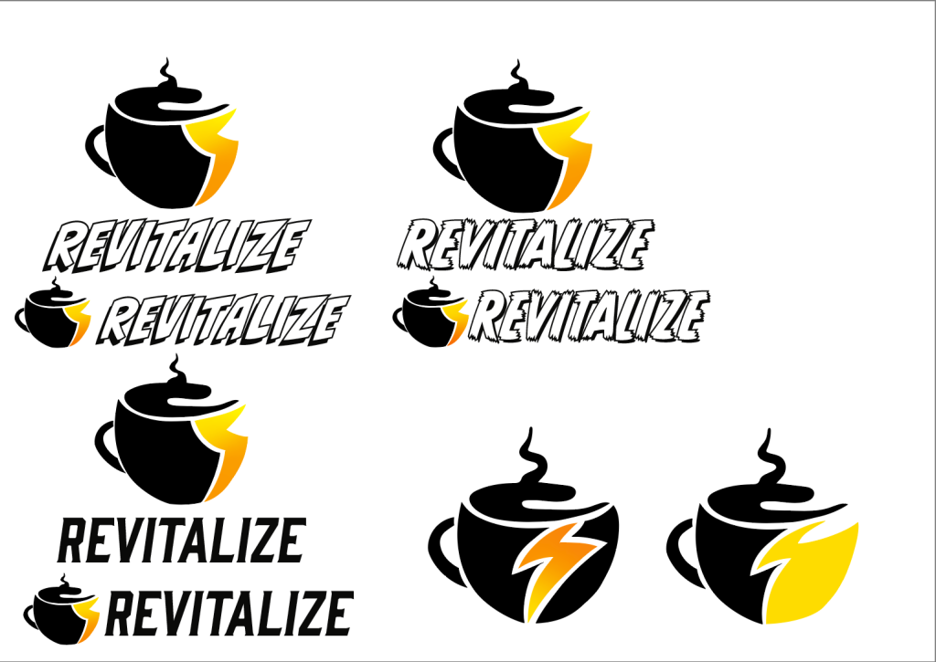
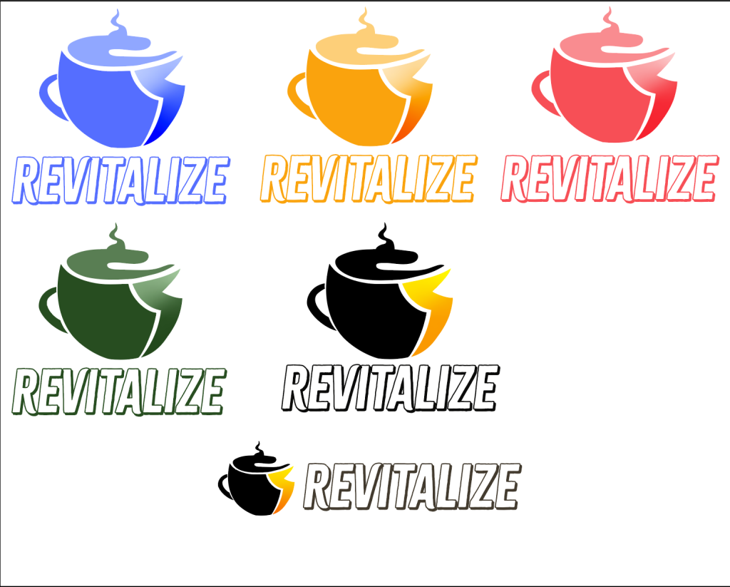
For my second attempt I decided to think of a name for the brand that was one word as it made it easier to place and fit with the logo and also a name that was more positive and eventually decided to use “Revitalize” as the description of the word is to “imbue something with new life and vitality” which is a lot more positive and it sends a message that’s what the aim of the energy drink is, and also that its what the energy drink can do for the target audience (over 60s). For the logo again I went with combining the tea mug and energy logo however this time rather than just having the energy logo go through the mug I had created it so that it became part of the mug. I again played around with a few different fonts and chose one that was more bold, clear and easy to read as it gave a lot more energy to the logo and screams the name a lot more. This logo allowed me to play around more with different colour variations too which was useful as these will be used for different flavours of my energy drink.