When designing my web and app designs for my rebrand of the Freedom Festival I wanted to make a design that was more modern looking and give off the feeling and energy that can be felt when at the festival. I felt the current design for the festival webpage was a bit boring and bland due to it having a blank white background and decided to research modern day websites to see what they included. Within my research I found that most modern day websites like to layout their sites in a grid like way, this is something I explored within my design and decided to implement, originally my design was all connected however I found this made the site look quite cramped and was very confusion for the reader to read. to counter this I spaced each block out throughout and then curved the edges similar to the current design as I felt the sharp edges made the images look as though they have just been copied and pasted onto the site.
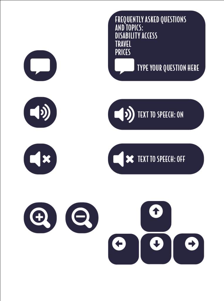
for the homepage of my design I took a completely different approach to the current Freedom Festival webpage, the original was heavily focused on the logo and didn’t include any information which I feel isn’t very effective as it may lead a viewer to click straight off the site as they can’t find the information they need. For my design I tried to include as much as I could on the homepage without it looking too cramped and been overly informative, I placed a number of blocks and images and set them up in using a grid, I aimed to include more key information and the more popular acts that people might be interested in. I did this as this makes the site easier to use and learn as the key information is right there as soon as you load into the site or launch the app, having the information given to you straight away is helpful and due to the more pleasant experience may lead to the viewer checking out the other pages and exploring the site even more. Another thing I felt the current design lacked in was accessibility considerations for the user as there is nothing that can be changed for the user. To counter this in my design I thought of a few changes that the user can make and change to their liking, firstly I have incorporated a light and dark mode which is useful as it makes the page more accessible to those who may struggle to read lighter/ darker text or background. Below are a few buttons that I designed that could be accessed within either a accessibility page or settings page which would allow the user to either zoom in or out for those who may be struggling to read the current font size, there is a text to speech option for those who may need or prefer to have the text read out to them and there is also a chat bot that would pop up from time to time where you can ask a range of questions.
I kept my design throughout to match my brand identity by using the same colour palette, font and phrases throughout. My design has a few phrases in such as “This is Hull” as the current website lacks any mention of Hull which isn’t effective as people may wonder where the event is held so including this avoids that and also celebrates the fact the event is based in Hull. I have also included a countdown on my design which I feel is effective as it lets the viewer know when the event is starting.
When it came to using images and text I designed them in a way that made them look like cards with the image at the top and writing at the bottom and rounded it off to make it look more like a playing card to give the design a bit more creativity to it as the current design I felt was too repetitive as it just had rounded images and then a coloured square placed underneath and then the text placed outside underneath. Designing them this way helped separate each topic as it connected the text and imagery together better which helps avoid any confusion when reading for the viewer.
For the app design I created it following the responsive design principles by shrinking each component down to fit the smaller screen size. This design is slightly different In some areas, as typically a website doesn’t include any animation as it is usually a simple click through. However, I avoided adding any fancy/ special animation as that may put the viewer off when viewing on a mobile device as it could make it look as though the design is trying to do too much, however on a few pages I used the fix to position when scrolling feature so that when they scroll down the page certain information stays on the screen so that the user doesn’t forget what page they are on.
Below is a video that would be included in the design where the placeholders for the videos can be seen however adobe xd wouldn’t allow my to import it in and so I have left the play buttons in to show where the video would be placed if it were included.
For the video I avoided including too much and had text appearing at different points with different animations, this is because I am still not 100% confident using the after effects programme, however having it more simple like this could be effective as it may help to get the message across more due to the text been the only thing to see.
My laptop wasn’t able to fully render all of the video so restarted at one point so I had to scroll back to the same point to show the rest of it.
The file size was too large to upload onto here so have left a google drive link.Also a YouTube link.
https://drive.google.com/file/d/12S5LotvqC7pU2jJoDbubTtV8BmIz-c-o/view