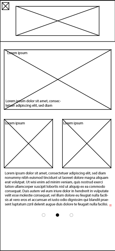
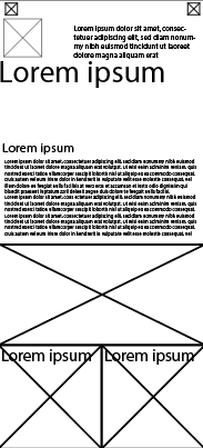
Below are some early wireframes that I created showcasing basically where I would place imagery and text, these are rejected designs with the reasons for this been mentioned in the blog post for cross device compatibility as I felt the designs were poor and left too much space creating a poor user interface.
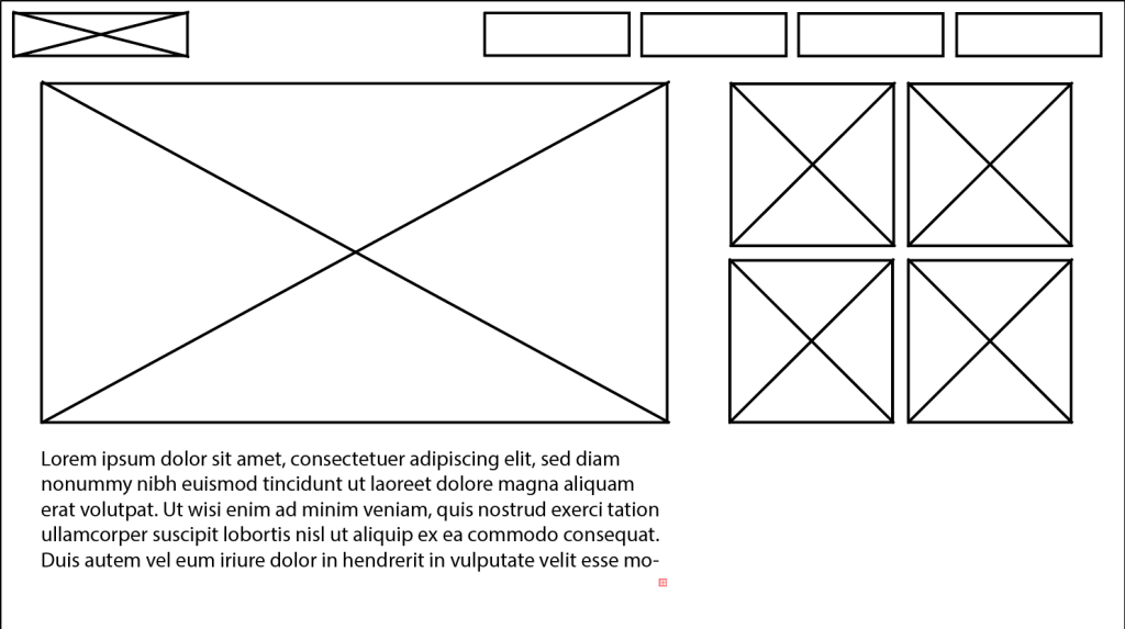
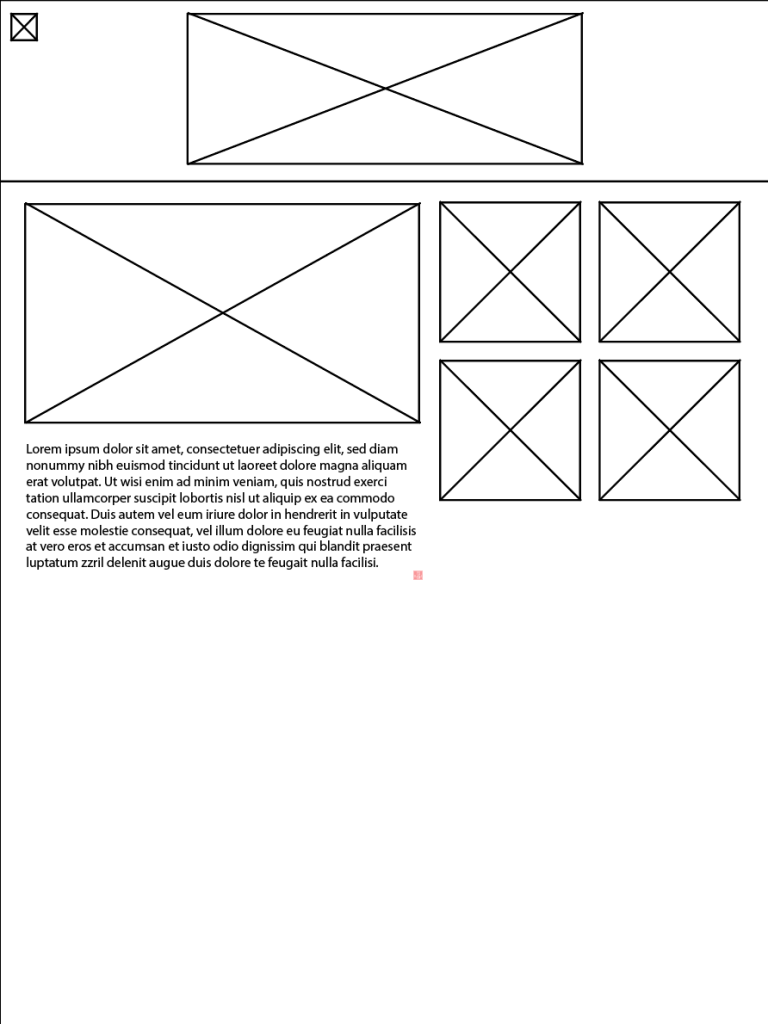
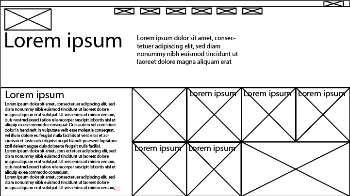
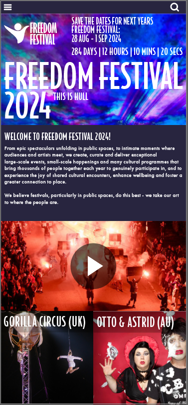
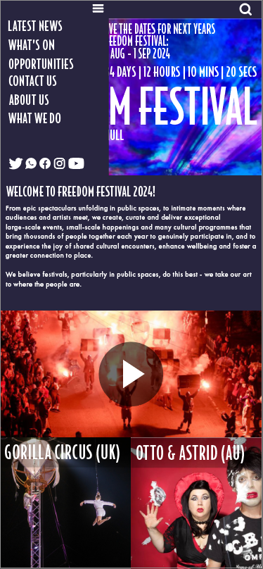
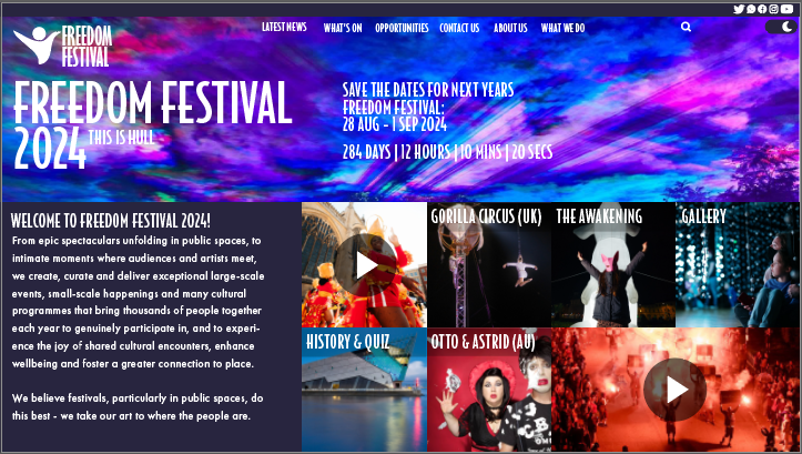
The images that are seen above are the latest wireframes and mockups I have designed, these wireframes I have created in Adobe Illustrator, for my second attempt I wanted to remove the awkward look from the user interface by removing the gaps within the tiles, doing this allowed me to create a much better user interface as it allowed me to fit more onto each screen and fit all the elements together making the interface more compact. These wireframes I created using a grid which was effective as it allowed me to create a responsive wireframe and design across the screens and allowed me to better scale the tiles to fit onto them with these wireframes I also placed greeted in text in roughly the same size I expected it to be in the final mockup to give myself and idea of it will look in the final result. Creating the interface by using tiles was an effective choice as it allowed me to scale each piece of the wireframes such as the images, logos, icons to fit on the other screens.
Something that I would like to add in the future of the interface is motion graphics, which I could include in my mockups of my landing page for example, as I could incorporate a graphic where the person from my logo stretches out from the side of the screen to form the logo, or coloured strokes that move within the image of the sky of the top half of the page, this is something I would later do in after effects.