To keep a consistent visual identity through multichannel media I chose a number of things to keep consistent to keep the brand familiar and recognisable through different media that would typically be used to promote the festival if it were a real thing.
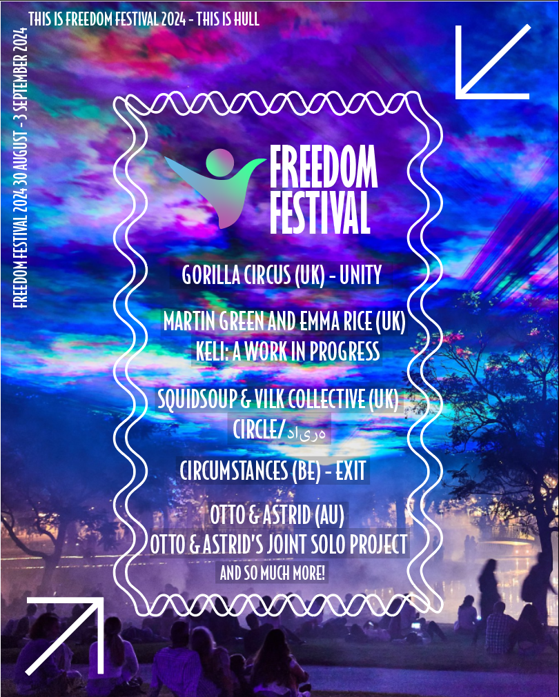
To begin with throughout all of the media I have created for the brand such as the webpage, the online ads, the posters I have designed a have designed them all using the same font throughout, I have used the font “BodegaSans Medium” this font I feel creates a more modern feel to it whilst it also been a serif font which typically a serif font is seen as more old fashioned. The font been bold helps create a more energetic feel to it and I chose it as I feel it relates to the word “freedom” do to its more stretched appearance making the font seem more free and when the font is made either large or small it still remains clear and easy to read.
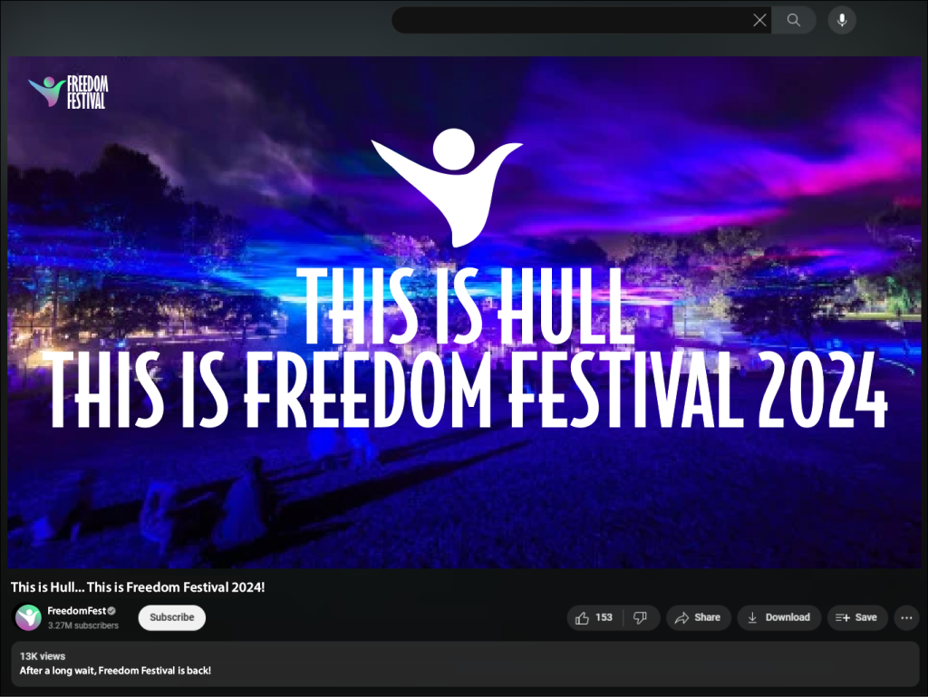
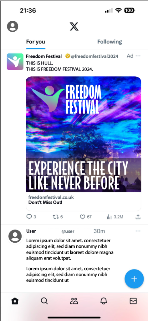
Another thing I kept consistent within the visual identity is the use of the image of the sky that I have included in everything I have designed related to the festival, I have used this image throughout as I feel it best captures the emotion and energy within the festival and also relates to the aim of the festival, due to its bright and vivid colours within the clouds and sky, which is to promote artists and so on.
Throughout some of the multichannel media I have created I have included the same phrases and quotes throughout such as “This is Hull” to further stamp that the festival is based on Hull and is where the festival takes place and to show it is celebrating Hull and the people within the city. The logo I designed is also heavily featured throughout and the colours within the person in the logo also feature thought to to further create something that helps identify the festival and create a sense of familiarity.
To improve my visual identity I could maybe incorporate a few more features such as shapes or something like brush strokes to further show the festival is about art and freedom, as I feel this is something that I am lacking throughout and so will add something like this in the final product.
The examples above are adverts and posters that would be of use for my version of the Freedom Festival and what you could expect, these could all be found on the website in some way, for example the poster could be a part of the gallery page on the site and act like a little advert on that page.