Above are images of early designs I was trying across different screen sizes by using a fluid design layout, using a fluid design layout allows the layout to changed based on the screen it is been viewed on, on this first design I decided to abandon as I felt I was trying the cover the larger screen by just simply making certain elements larger and just stretching them across the screen, I also felt the design of my first attempt was poor as I created it using just images and looking now can see they clash a lot, also leaving the space between each tile made the design look quite awkward as on the larger screen size I felt myself having to make the gaps between each tile even bigger and made it look as though I was just trying to fill the screen.
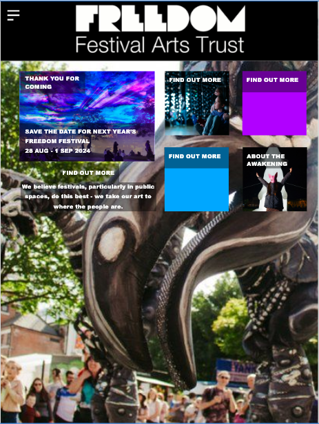
For my second attempt, as I mentioned in another post, I created this using a grid and by also dividing each screen into sections, for example the top half of the page was the area which had the logo on the name of the festival and the tabs, and the bottom half was where I would place the tiles and information, this time using a grid allowed me to upscale the tiles in order to fit the screen correctly and by also connecting each tile this time avoided that awkward gap and while I have taken up all the space in all screens I have avoided it looking cluttered and messy by organising this design into the sections that I have.