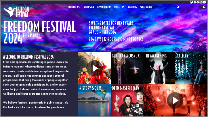
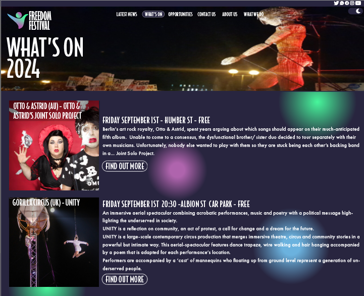
For my rebrand of the Freedom Festival I wanted to create a webpage that was more modern looking and also was more filled without looking too crammed and over the top.
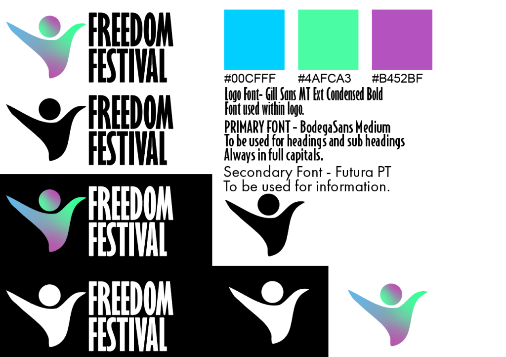
To begin with, I redesigned the logo of the festival and wanted to include something so that it wasn’t just text like the old logo, so my idea was to create a a shape that looks like a person that is waving their arms in the air to further show the message of “freedom” as typically when some expresses them self as free that’s something they would do. I also created this so that the logo could either be used with the text or used without with just the person, I did this so that the person could be used in things such as profile pictures on social media pages for the festival, and just to create an icon that people could recognise and familiarise the festival with without having the read the name. This logo I also feel is better to be used across a multichannel use do to it been more square and not just one long stretched line of text like the old logo, and so could be used on things such as merchandise on something like a shirt the logo could be placed on the top left or right, or another example could be a mug. The logo I also designed in mind that still looked effective in just a basic black or white colour which I made incase the colour within the logo clashes with the background which can be seen on some cases of the website where I have just placed a white or black version instead.
For the website design I created using a grid and creating it in the form of blocks/ tiles I designed it this way as I feel it makes it much easier to navigate and also creates a much more modern feel to it as you see a lot more modernised websites taking the same route. I tried to fit all the tiles in the landing page so that everything the user needs can be found straight away and so scaled the blocks to fit in order to do this.
For the colour scheme I added splashes of colour from the logo throughout the site as can be seen in an example above and for the background I have used a darker shade of the purple/pink colour that is used within the logo, this is something I am going to do with the finished product of the webpage where I will use different shades from the logo not just the pink/purple but also from the green and blue too.
For the type as I have mentioned in the image above the type within the logo is used for the logo only as I felt the other font I used for the headers worked better with the webpage but didn’t work with the logo, and the secondary font I have chosen as it is clear and easy to read even when shrunk and enlarged.
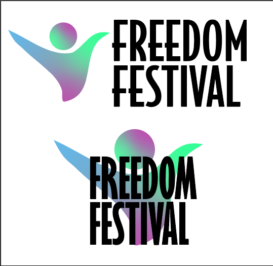
I experimented with a few different variations of the logo (can be seen below) where I tried a different font and also experimented with placing the icon behind the text, I decided against playing the icon behind as it clashed too much and became hard to read.