
The current website for the Freedom Festival is created in a way that feels more modern and welcoming. To begin with, the site uses two sets of san serif fonts that is clear and easy to read as a contrast has been used to do so. A hierarchy is been used to direct the user of what to read first and so on, as can be seen with the larger and bolder fonts used in places, and then the change in colour in text for other important pieces of information making the site easy to navigate. Behind the logo “FREEDOM” on the main page a video is added which showcases some of the events and atmosphere of previous festivals which gives the user a idea of what the festival looks like in real time.
The overall user experience is quite pleasant as when you first open the site there are no pop ups or ads and this continues when browsing throughout the rest of the site. At the top is a bar with a few categories which are easy to navigate and tell the user all sorts of things such as the latest news about the festival, how they can get in contact and more, and then at the very top right hand corner are a few social media icons which can be clicked should the user want to follow them on any of them.
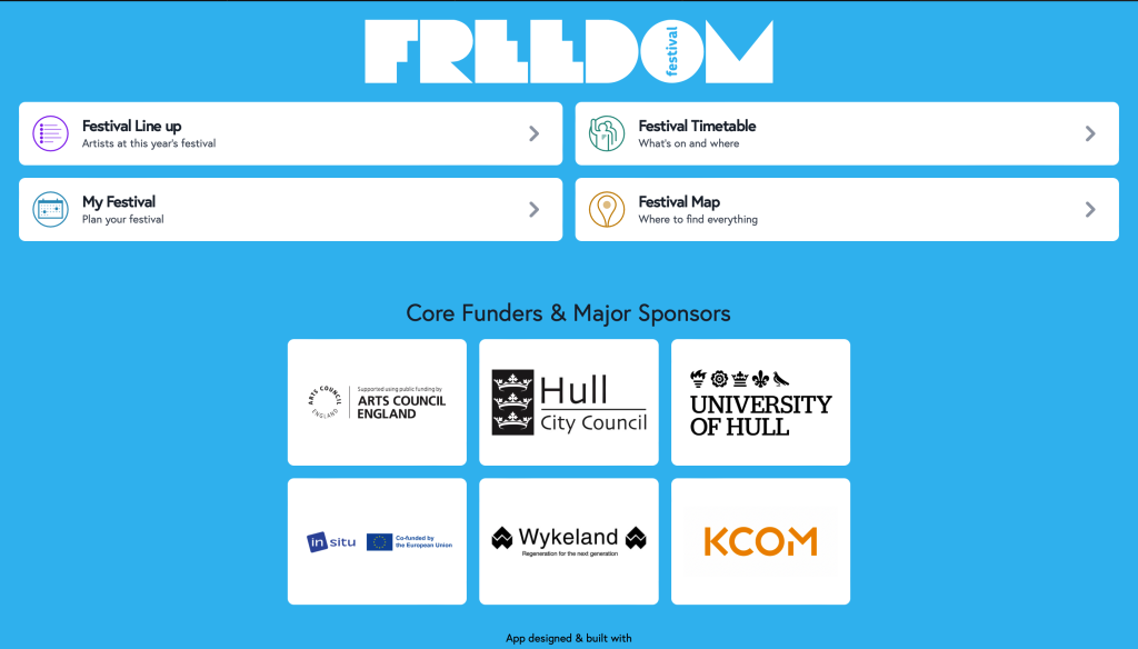
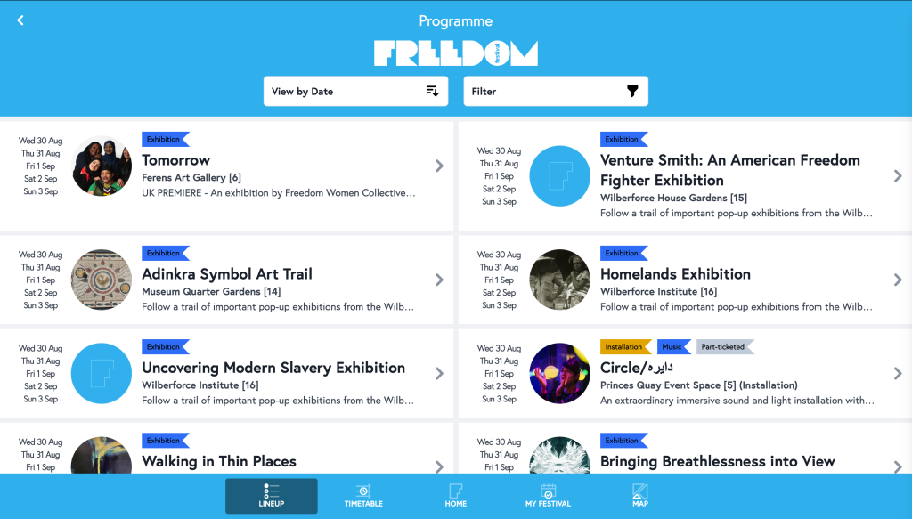
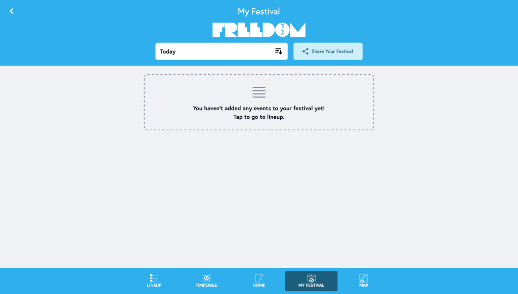
This is an older app/ web page I found that was used to for the Festival in 2021. This webpage is a lot more basic in comparison to the current page, and you could say is a lot more boring and lacking on the creative side with it having just a basic blue background with the white tiles as buttons. However, the white tiles do create a contrast against the black san serif text keeping it easy to read. This webpage contains the time and dates of events and the location they are been held an allows you to create your own timetable so that you can plan out your time whilst at the festival, which is something quite unique and don’t see often on other festival based web sites which is something that may please a user using this page.
However, the lack of other information about the festival is something that may cause the user to feel more negatively about the site as it means they will have to do more research elsewhere. There is no spam or use of adverts on the site which is always a positive as it avoids it having that cluttered look and gives a stress free experience.
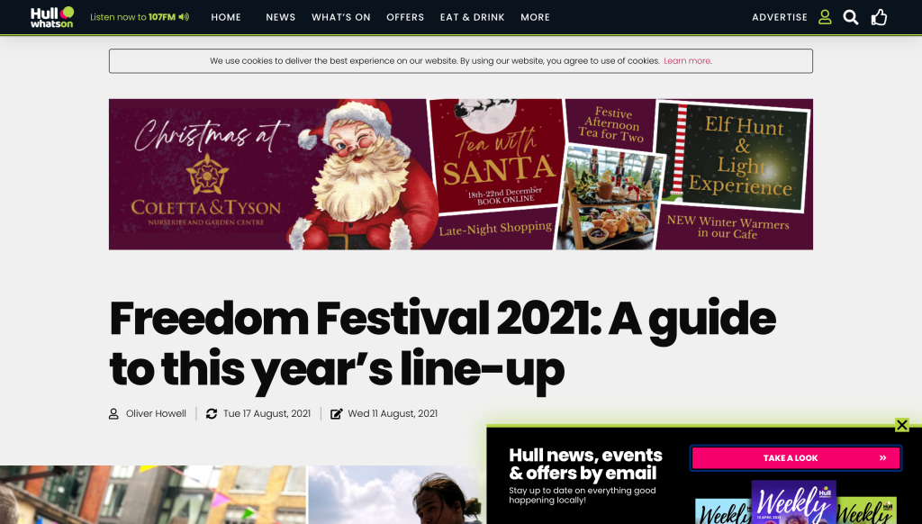
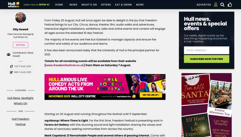
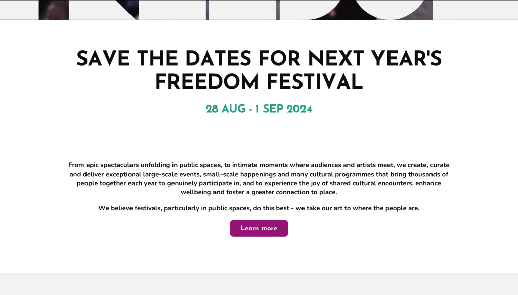
This is a webpage that I found when searching for previous Freedom Festival sites and was published in 2021. This page also looks more modern due to the use of san serif fonts. A hierarchy has again been used ro direct the user and tell them what the aim of the page is as can be seen with the enlarged and bold text. The site is clear and easy to read due to the contrast again of the black on white, and the site also follows a nice decorative colour scheme throughout of black and green which the green is taken from their logo. The overall goal of the website is to inform users of what is on during the festival and does a good job at doing that and more as at the top there are categories that are clear and easy to use telling the user about the news of the festival, special offers and extra pieces of information like where they can eat, which creates a quite positive experience.
However, what lets this site down is the amount of ads and pop ups that are featured within it as can be seen in the screenshots, this makes the overall experience a bit worse as it gets quite frustrating having to click off the pop ups and see the ads everywhere.