The web and app I chose to examine are those promoting the Rio de Janeiro Carnival that takes place in Brazil every year.

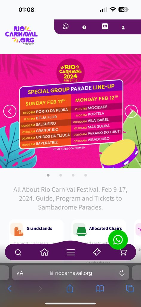
For the web page you see the page is set up with more of an F reading pattern as you read the top bar with the few categories from left to right then slightly below that is a few images that you can scroll through which displays a few pieces of information about the carnival and then you go slightly below that where you can see a bit of information with all the tabs just below that which contain details on certain things about the carnival too. The page also uses a slight hierarchy which can be seen in the tabs with information as you can see the headings been highlighted in a bolder text and also a darker colour which helps navigate the user and tell them that’s the more important piece of text to read. The home page I feel is very well designed as it creates a pleasing user experience as it is easy to navigate as straight into loading into the site key information is displayed such as the date of the carnival, the lineup, and the many tabs which are easy to use and navigate that hold information such as ticket prices, seats and so on. The site also does a good job of giving the user a feel of the energy of the carnival straight away by using the bright colours, patterns and the theme of the carnival throughout the website.
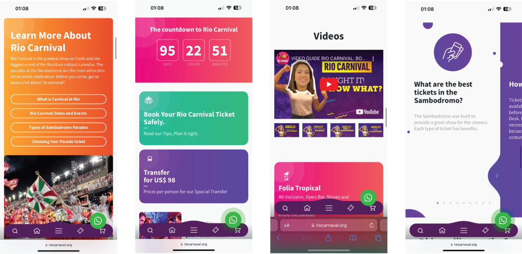
The app is slightly different but again uses the F reading pattern as you start at the top of the screen where you can see the logo for the carnival and then the bar at the top right hand side of the screen with a few widgets and then the photos again below with the information and categories below that too and the same hierarchy can be seen with the bold text in the categories. The mobile website includes includes a bar at the bottom of the screen where you can search for something, a home icon to take you straight back to the home page, a burger icon which contains a few categories with some important information in and also a ticket and shopping cart icon so that you can go straight to buying tickets, creating a pleasant user experience as its easy to use and has all the vital information in one place.
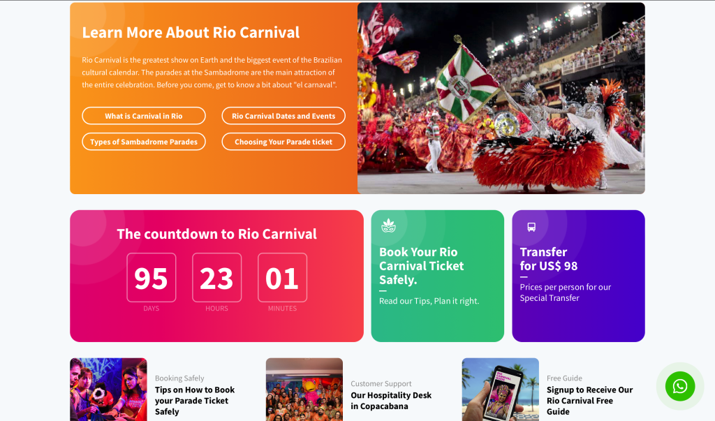
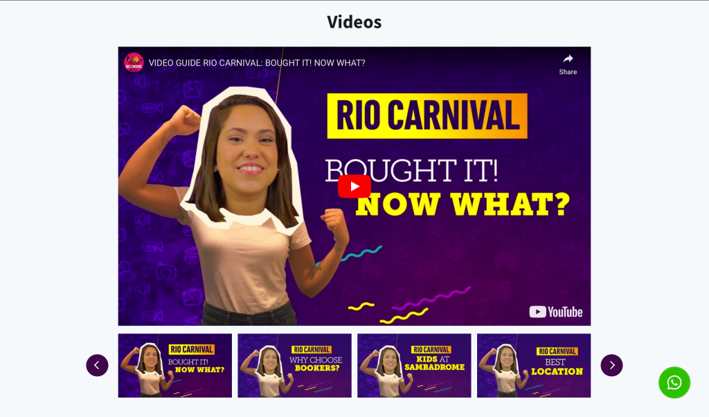
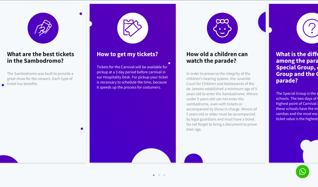
Scrolling further through both the website (pictures above) and the mobile based website (pictures below) more important information can be found such as when the carnival starts, ticket prices and also step by step guides making a further pleasant user experience. You can see that a brand identity is been used with the logo featuring in the top left throughout, the same type, type weight for titles and the same energetic colour palette been used throughout the site with the purple from the logo been used predominantly with a few extra bright and energetic colours, the site also uses the same rounded square tabs throughout which is effective as it clearly indicates the user to click them for information. The colour palette is a good choice as while it is energetic as I have mentioned it is not over the top and remains simple as there are only a few colours used, these colours combined with the white background are clear and easy to read and the colours used also fit well with the logo meaning they could be used for other things to promote the carnival such as a social media page. The site also includes many YouTube videos explaining things about the carnival which is effective as it helps create a social network with people been able to communicate through the comments on social media, also having a form of video and audio explaining things is a positive as it is helpful for those who are visually impaired or have a hard time reading.
The site overall does a good job of selling and promoting the event due to having all the key information in one place and easy to find and access. The site including things such as the YouTube video with the friendly and welcoming woman creates a friendly feel to it which helps keep the users attention as does the bright energetic colours used. The addition of the bar with the widgets on the mobile device is effective and shows they have considered those who may be viewing the site on a mobile device creating a positive user experience for those users.