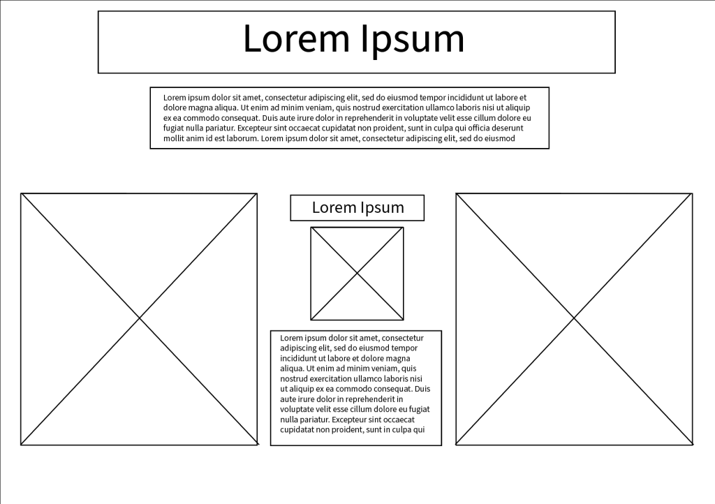
Originally I was going to lay my website out in a single column having just one long row of the original works and my works, however when creating the wireframe i felt it created a lot of white space, also my idea was to leave the background completely white as i thought it would create a clean and simple looking web page, however when i created the first slide on Elementor it looked the complete opposite, it looked empty and bland, and looked as though it was rushed and made with very little care and so i decided to scrap that approach and created a whole different wireframe (which can be seen below)
This layout is a lot better as it counters that emptiness the original design left as it fills almost all of the page, whilst also giving more room for things such as text and information, this layout also makes it easier for whoever may choose to look at the site as seeing them side by side rather than having to scroll down is a lot easier for the user, creating an overall better experience. To counter the white background looking empty and bleak I created a custom background consisting of a few 2D clocks in random positions and then repeating that to create a bit of decoration and to counter that emptiness, i decided to use clocks to stay relevant to the theme of the website which includes history and time. Below is an example of the background in use.
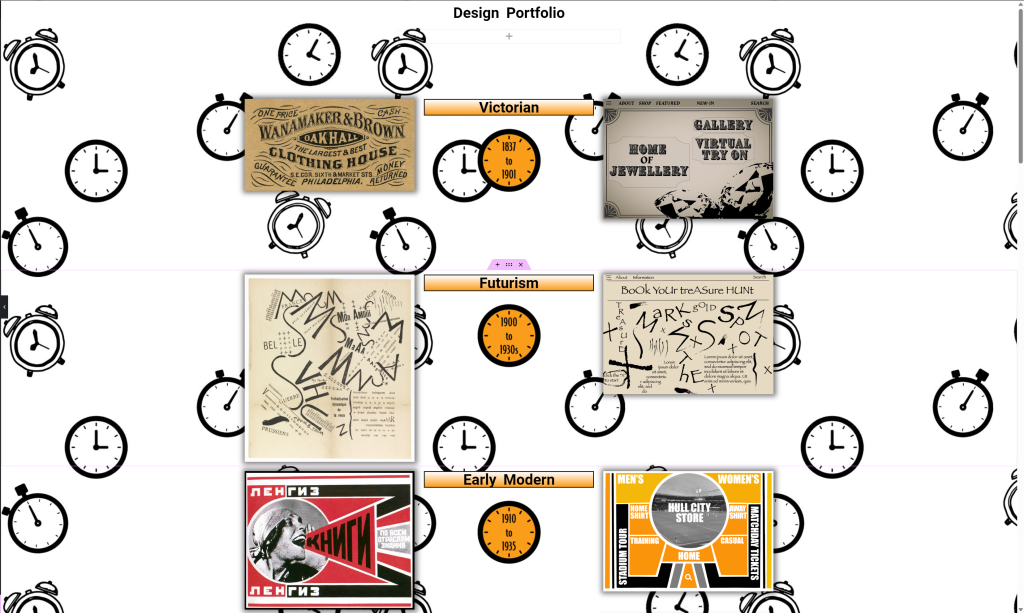
With this new background in use I realised it clashed with the text on the site so to counter this I added backgrounds to each headline and piece of text to help separate the two, I chose to fill the background with the same colour used within the logo and the icons with the time periods in to avoid it looking a bit random and messy with lots of different colours. I also noticed the main headline at the top of the site looked too small and the rows were too tightly placed together and looked a bit crammed so to counter this I placed a few spacers and also some arrow icons pointing down to show how to follow the page and also enlarged the main headline too.
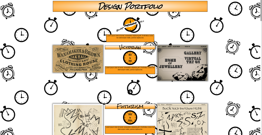
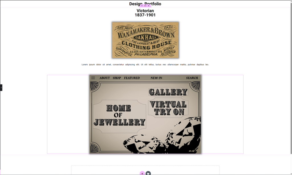
Here is the final layout I decided to use for my site, its a drastic change from the first attempt and is most definitely a change for the better.
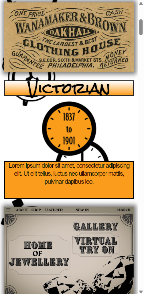
Although the single column may not have worked for the desktop site, it did however work for the phone/ companion version due to the slimmer screen there wasn’t as much white space and looks a lot more well placed in the phone view and compact.