Brutalism is a style that emerged in the 1950s in the United Kingdom, it is mostly known in the architecture world also known as Brutalist Architecture. If a building is classified as “Brutalist” it would be due to its massive, monolithic and blocky appearance that has a rigid geometric style and is constructed using large amounts of concrete.
The term “Brutalism” was first spoke by British architects Alison and Peter Smithson and was later popularised in 1954 by architectural historian Reyner Banham. Brutalism became a popular style throughout the 1960s and was used regularly for government projects, universities, car parks, shopping centres, high rise flats and so on.
Within art and graphic design brutalism has been used to describe the work of artists influenced by “art brut” which is a French term that translates to “Raw Art” which was invented by French artist Jean Dubuffet to describe art such as graffiti or naïve art which is made outside the academic tradition of fine art.
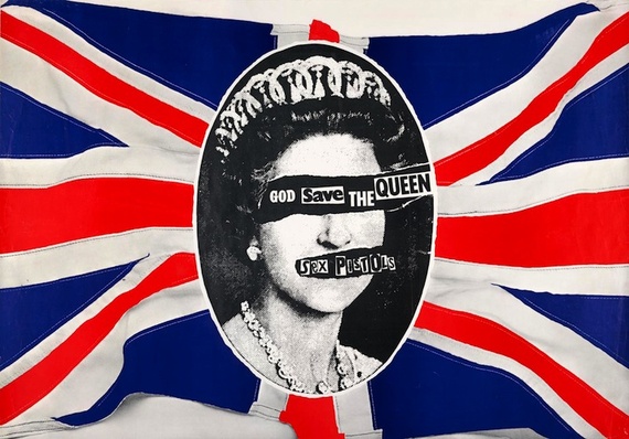
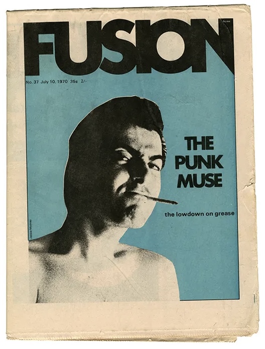
Punk graphic design is seen as something of more of a rebellion, a movement which shows anyone can do it whether that be design, art, fashion, literature and more, punk was about been the opposite, and was mostly involved with the youths. Something that is punk is something that is fast, messy and unpolished. Punk design is about questioning the standards and defying the norms.
Punk burst onto the scene in the 1970s and was a reaction against the rigid restrictions of Modernism and was a demand for change, and was something that was used to communicate political messages and to rebel against the government and politicians.
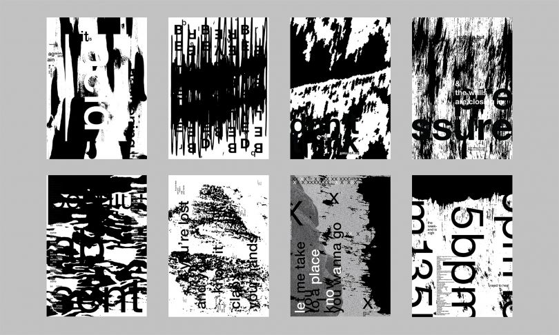
Anti- Design is an approach that rejects and challenges the traditional aesthetics and rules for graphic design, resulting in new and innovative. This approach can be mostly seen be used in web and app design. The term anti- design is often exchanged with brutalism, whilst they can look similar they have their own history. Anti- design isn’t a rebellion against the standards of design it is a process to offer an alternative to accepted design standards. To best describe anti- design it can be described as thinking the opposite of a specific aesthetic. Some designers use this style of method to create new experiences, interactions and to create mystery and create the unexpected. The characteristics of anti- design is constantly changing due to the norms of graphic design constantly changing as it is in simple terms the opposite of what is seen as normal., However, in most cases anti- design does share a few constant characteristics such as asymmetry, overlapping and crowded text, clashing colours, lack of grid used and mismatched elements. Anti- design doesn’t really have a origin date as for as long as art and graphic of any sort has existed there has always been those that have felt constrained by the standards of them and have created pieces challenging and breaking free from those standards.
For my works I explored all of anti- design, brutalism and punk design.
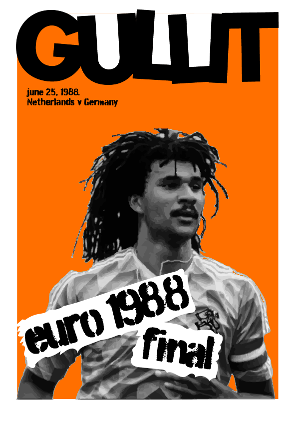
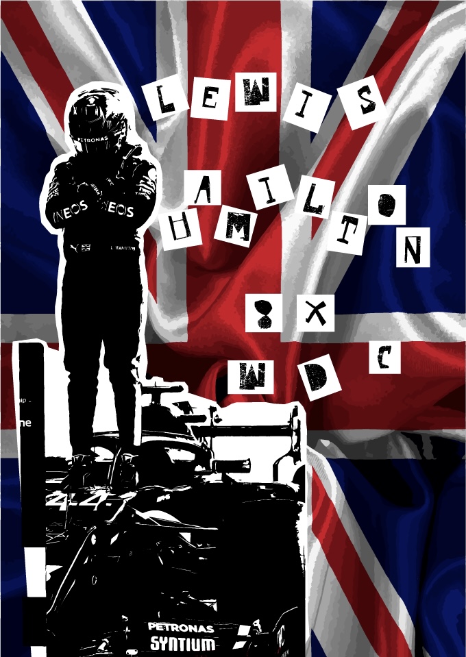
For my first piece I created a poster in the style of punk to promote the 1988 Euro Final, I kept it in the style of punk by trying to make it look as though it was made quite fast by giving it that messy look punk design has by using a messy style of typography which can be found within a punk piece of work. I created this piece in the same format and layout that the piece “Punk” an aesthetic edited by Johan Kugelberg and Jon Savage (Rizzoli) had. My second piece is also created in the style of punk, however this time I included a controversial message within like some punk pieces do that reads “LEWIS HAMILTON 8X WDC” WDC is an acronym for World Drivers Championship, as in 2021 Lewis Hamilton lost out on what would have been his 8th and record breaking drivers championship.
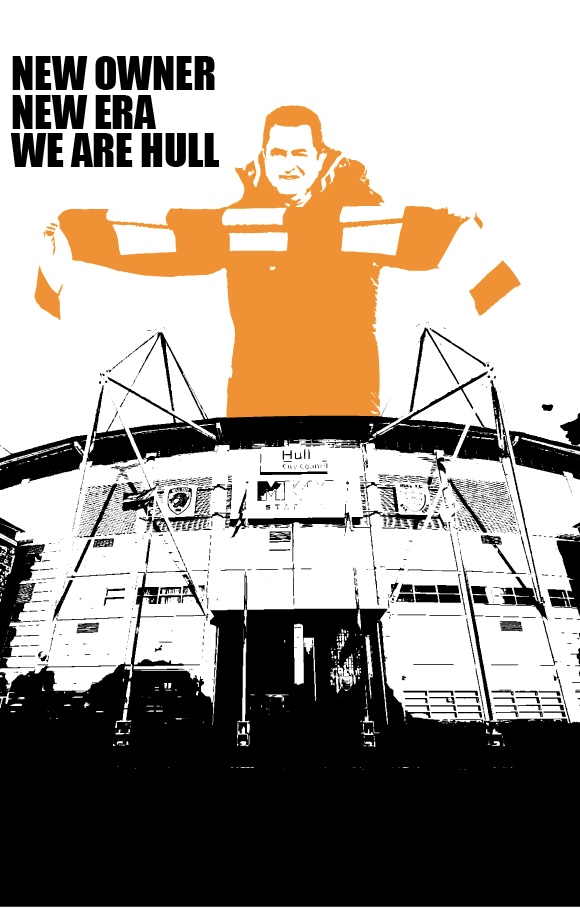
For my third piece i created a poster celebrating the takeover of Hull City, i created this in the style of Brutalism by using blocks of colours and used mostly dark colours with the majority of the piece black and a slight use of amber to keep it relevant to the teams colours which makes the piece look quite heavy, similar to Brutalist Architecture with the blocks of cement used within the buildings.
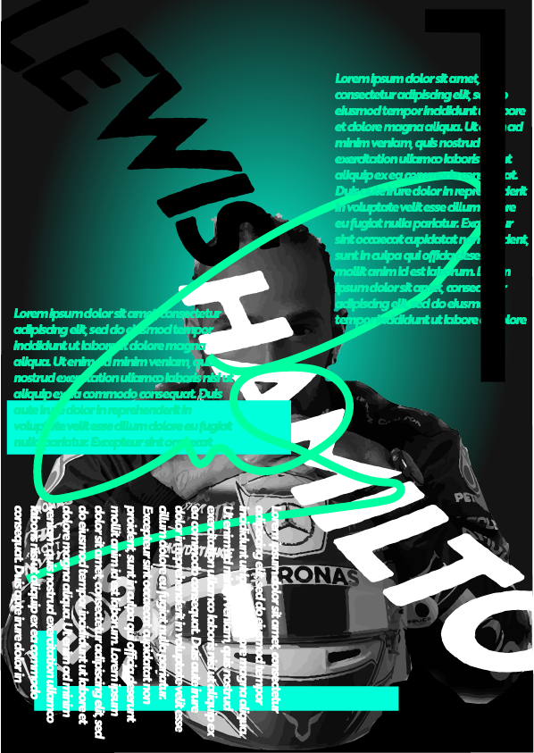
For my final design I again created a poster involving Lewis Hamilton, however this time in the style of anti- design. To do this i got an image of Hamilton and placed numerous layers of text and shapes warping and rotating them and also a large illustration of his signature and used clashing colours to give that anti- design look. The choice to use shades of mint green throughout is because that’s the colour scheme of the F1 team he drives for (Mercedes) which is black and mint green.
Images can be found here:
https://99designs.com/blog/design-history-movements/anti-design/
Sites used for research can be found here:
https://www.designingbuildings.co.uk/wiki/Brutalism
https://shyndman.medium.com/how-punk-changed-graphic-design-ad40cb685180
https://99designs.com/blog/design-history-movements/anti-design/