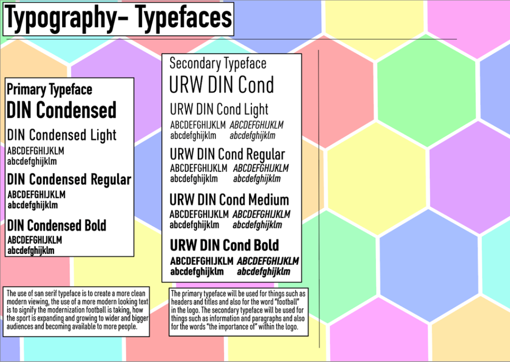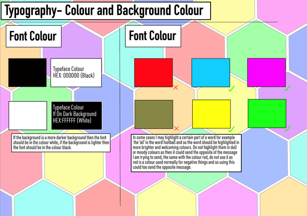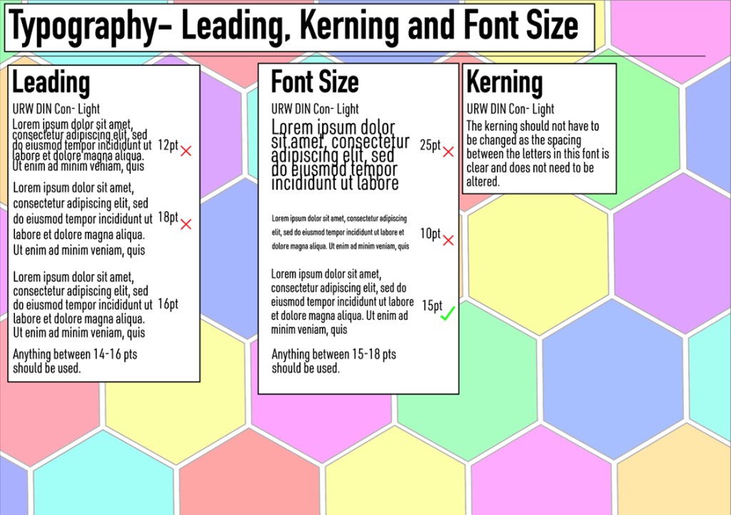


To begin with, my first typographical graphic standards sheet explained the correct typefaces to use and where and how to use them, the use of a more bold primary typeface is to further highlight the main focus of the pieces such as the titles. The choice to use a more modern san- serif font was to highlight the steps football has taking as a whole in its growth and modernisation, furthermore, the use of a serif font might make it look too fancy which isn’t the look I want as it might give people the impression that the pieces I create are aimed for more higher/ upper class people, which is not the case, my aim is to show football is for everyone. I chose to use a more light typeface rather than a bold variation for the secondary typeface for multiple reasons, firstly, the use of a lighter typeface allows me to make the size of the actual typeface smaller, the same can’t be said with a bold font as once they are made too small they start to look chunky and merge down into more bubble like writing and becomes hard to read. Also, combining two variations of bold typefaces together would make it harder to highlight the more important parts of my pieces of work such as the title, making it lose its power within the piece and the importance of that word, also the use of a bold typeface with a more lighter typeface creates a sort of contrast and helps separate the two. With the second sheet I explained which colours to use within the logo, more specifically the “all” in the word “football” I created a sheet for the use of colour as I believe it is an important part of my logo as the wrong use of colour could drastically send or change the message/ meaning I am trying to show. To keep the design of my sheets relevant to my subject (football) I added hexagonal shapes to the background to signify a football as typically that is what a football is made from, and I also left a white gap between them to also represent a goal net as they are too also made from hexagonal shapes and the rope is typically white in most football stadiums. I added a white box under the information on the sheets in order to keep it readable as I felt without it the shapes were clashing with the writing making it harder to read. Within the third sheet I explained my preferred use of kerning, leading and font size. I created this sheet as it is arguably the most important element when it comes to creating pieces of work with text, as if this is used incorrectly it can ruin the whole of your work. The size of my font I decided to go with was in the region of 15-18 pts, I felt anything under this was too small and from distance would be difficult to read and anything over this would be too big and just look like your trying to easily fill a page. With the leading I decided to go anything between 14-16 pts, anything under this the lines were too close and would cause descenders and ascenders to clash. Anything above what I went with would leave too much space between the lines and again look like your are just trying to stretch the lines out as much as possible to fill space.