With my three cover designs I wanted to show how football as a sport can help people of any age, sexuality, ethnicity, religion and so on and how it can be a place where people come together, and how it can help anyone in many different ways.
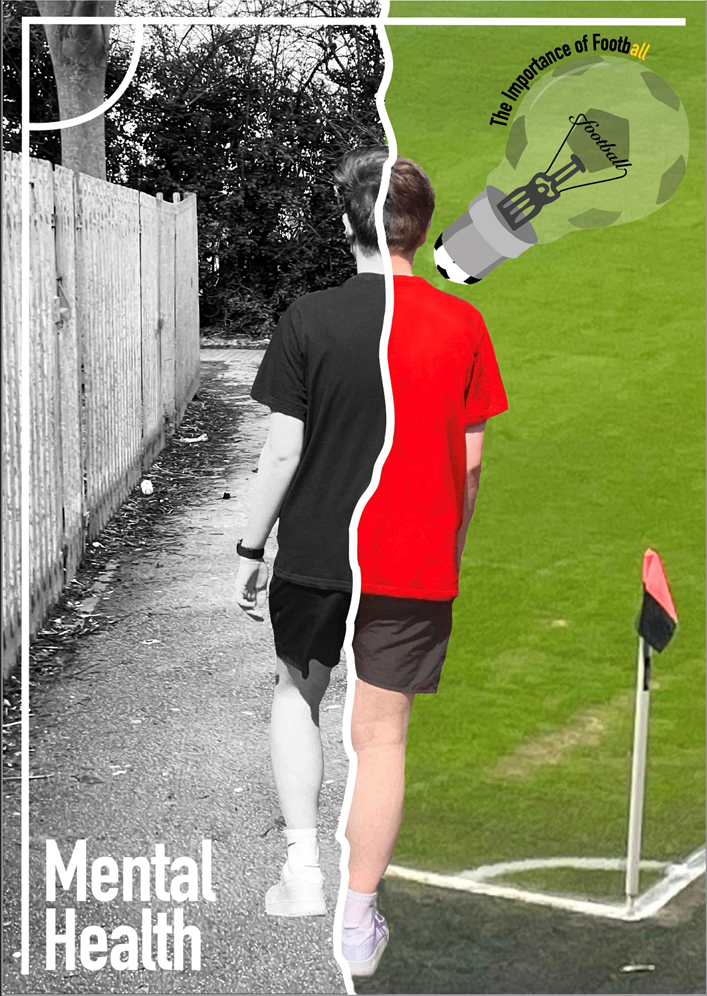
This first poster my idea was to create a poster that shows how those struggling with things such as mental health can be helped by the sport of football. The left side of the image is filled completely in a black and white tone, this was done to signify how someone may be feeling inside as using a black and white tone gives a more moodier emotion/ feel to it and gives a slightly life less feel showing how a person may feel in their normal everyday life. On the right is the complete opposite I created that side with the background of a football field in more vivid and more energetic colours, I did this to signify the emotion you can feel when playing or watching football. The use of more brighter and vivid colours is used to show a happier emotion. Together this was created to show how people can help people who are struggling and turn them from dark and grey inside to a more bright and warmer feeling inside- a happier feeling. I created this piece using a mixture of illustrator and photoshop, I took the photo of me and my brother and created a clipping mask so it was just me, I then used the colour replacement tool and made the left side completely black and white and on the right side changed the colour of my shirt to a bright red colour to add more colour to it.
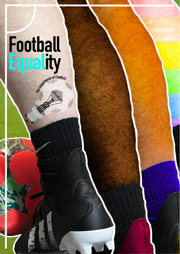
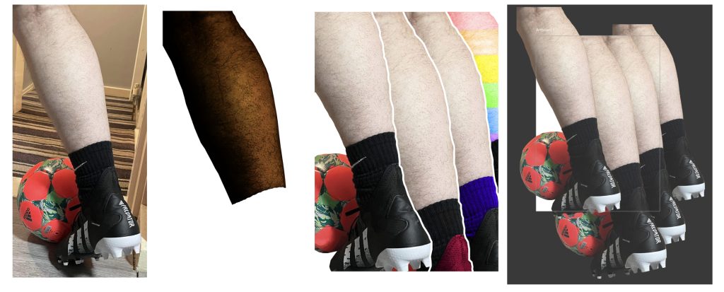
With this poster my aim was to send a message that football is a place for everyone and how everyone should be treat equally whether that be in the football community or not, and how football can be a place for people of different ethnicity, religion, sexuality and so on to connect and bond. I created this image by taking an image of myself kicking a ball and overlapping itself multiple times, but changing the tone of my skin on a couple to make them look of different ethnicity and adding a rainbow of one to highlight those of different sexuality to show how football is a place welcoming of all, which should be the same outside the sport too. I did this by using the colour replacement tool on photoshop and also changed the colour of my boot and socks so that it didn’t look like the same repeated leg and also used the clone stamp tool to remove the branding on the back of my boot. I then added a white line to separate each leg so that each one stood out that bit more. I highlighted the part “equal” in the word “equality” also to show how everyone should be treat equally.
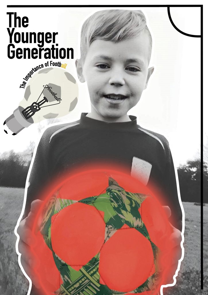
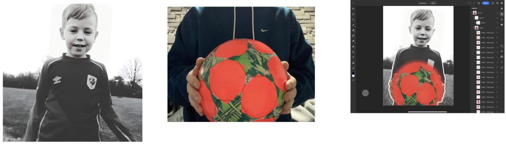
For this final poster I wanted the show how football can be used as a tool to help the younger generation, whether that be mentally, physically or socially and help them with something such as social interaction and help them find and build friends for life which is what football can do, or how it can just simply be something they find joy in. To create this image I used two images, the first been of my little brother, I used this image as I felt it was quite powerful due to the big smile he has as it shows he’s having a lot of fun playing football, helping reinforce my point I’m trying to show. The second image is of me holding a football, I created a clipping mask and removed myself and left just my hands and the football left. I added the two together and then took the image into photoshop and using the clone stamp tool removed my brothers arms from the background and made it look as though it is him actually holding the ball, I then added a ring around the ball and used the Gaussian blur to make it look as though it’s glowing. I did this as it looks as though my brother is almost handing the ball over, so making the ball glow you can say how its like a beacon and my brother is passing it over to show what football can offer.
All the titles in my posters were designed in relation to my typographical standards sheets using the the correct fonts and colours.
All images used in my cover designs are my own.