Typography Work.
Typography is the method/ art of arranging letters and text in a way that makes the text the clearest and most visually appealing to the viewer/ reader. Typography uses appearance, font and structure to convey specific emotions and messages to the reader.
Important factors to consider when using or creating your own use of typography include typefaces, point sizes, line spacing, letter spacing, line lengths and the space between certain letters.
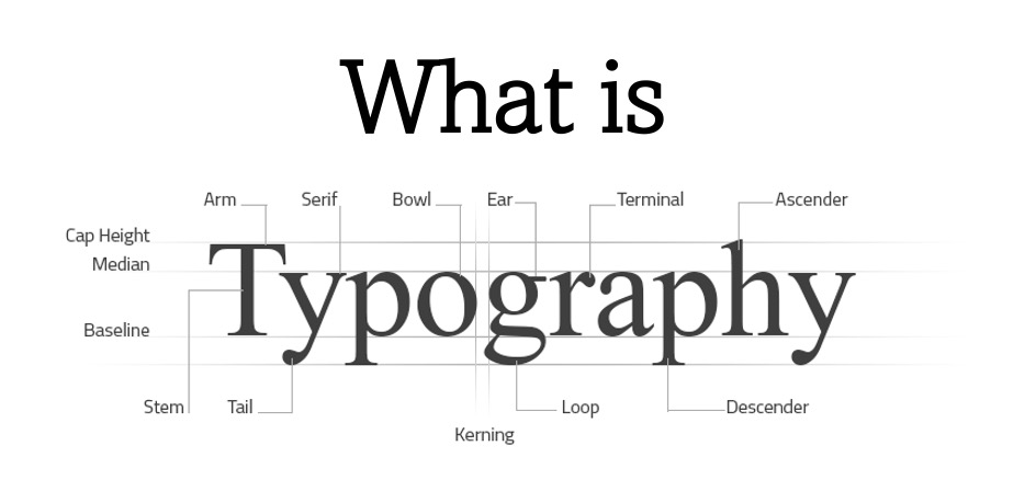
–Leading is the word used to describe the space between two lines of text.
–Tracking is used to describe the space between each letter.
–Kerning is the term used to describe the spacing between each character in a proportional font.
–Arm is the term used to describe the horizontal stroke at the top or bottom of a character.
–Bowl is the term used to describe the enclosed space within a character.
–Ear is the term used to describe a character that has a small stroke that projects from it.
–Ascender is the term used to describe the upward stem of lowercase characters.
–Descender is the term used to describe the part of a character that extends below the baseline.
–Baseline is the line in which the text sits and is written on.
–Tail is the descending stroke of a character.
–Core is the term used to describe the vertical or diagonal strokes, the core part of a letter.
–Median is the term used to describe the ceiling for numerous lowercase letters.
–Cap Height is the term used to describe the height of a capital letter.
Brief History of Typography
Typography as of today has been traced as far back as 1850 to 1600 BC and is believed to have originated in Greece. Back then punches and dies were used to create seals and currencies, typographers back then would use something known as a Phaistos Disk and they would carve their chosen language into the disk and then press this into their chosen material.
Once language had moved into more formal alphabets, the typography we see today began to emerge. Manuscripts in the middle ages were handwritten in an illustrative way and scribes used rounded, elaborate lettering which began the art of calligraphy writing and neat, formal layouts and letterings became widespread across the world.
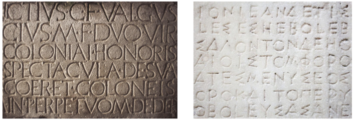
Serifs– in simple terms serifs are described as the parts that stick out from the edges of letters. It is believed that serifs originated back in the Roman Empire as text was painted on stone plinths or columns by a signwriter then chiselled out by a stonemason and the chisel would leave bits on the edges of letters where they’ve been chiselled away.
Roman Carved Text Ancient Greek Text
Why is Typography Important in Design?
The main purpose of typography is to help communicate the message or meaning behind a certain design piece you are creating. One key function of typography is aesthetics, its important to keep the design as tidy and clean as possible whilst keeping it relevant to the message you’re trying to send. If a design is too stacked and busy it can be confusing to the viewer/ audience and cause their eyes to become stressed and strained and then therefore cause them to immediately drop their attention away from the piece.
Good use of typography.
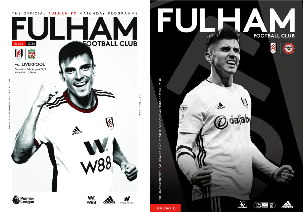
-contrast, spacing, bold, blends, easy to read/ recognise, modern design, san serif
In my opinion these are both good uses of typography for many reasons. To begin with the choice of colour is, although simple, very effective- the simple use of black and white makes it very easy to read as black and white are opposing colours, helping the text and background be separated making the overall readability very good and easy. Also the use of white and black is a nice touch as it represents the colours of the teams (Fulham) colours, which may help people to identify what the overall cover is. The text been bold and in san serif form makes the lettering clear and easy to read and doesn’t cause any stress within your eyes, the spacing is well done as it’s not too far apart and doesn’t look like it’s too close and cramped together. Also the font been as bold as it is it gives off quite an energetic and sharp feel for it, which is something you would expect to feel when entering a football game- the energetic atmosphere. Furthermore it gives off quite a modern feel to it as it uses the simple san serif font. Although it is simple it is effective, if overcomplicating typography it can create a very negative typeface or creation, this is because if you put too much effort into a piece of typography you may add too much and decrease the overall readability- this shows how sometimes simplicity can be key for a good use of type. The title been larger than the rest of the lettering on the cover helps separate it making it the focus point showing that is the important piece of type on the cover and the lettering around it is the secondary pieces of information.
Bad use of typography.
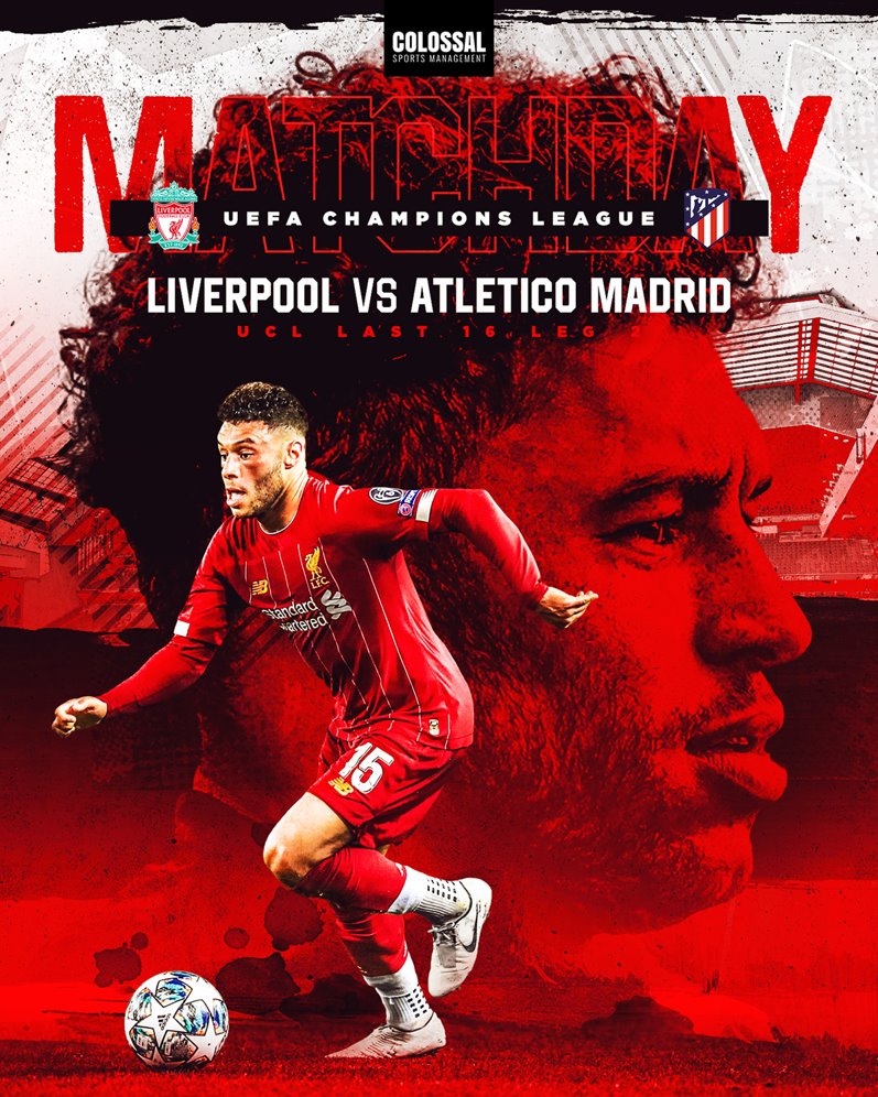
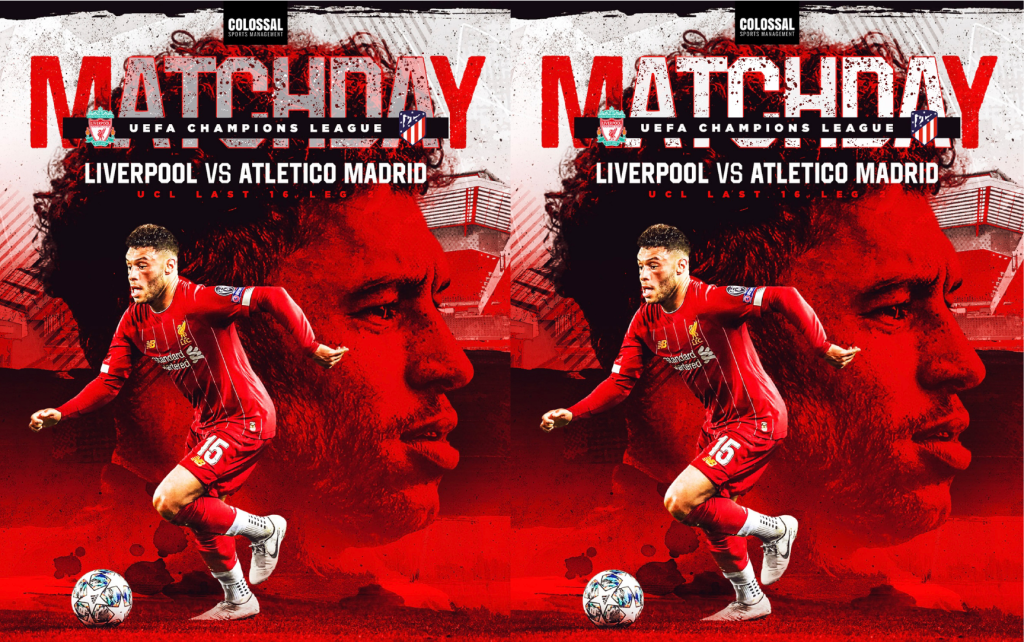
In my opinion this is a bad use of typography for numerous reasons. To begin with, the colour choice is poor as for some people who are more visually impaired they might struggle to read the text as it is the exact same colour as the big image of the players head. Furthermore, making the text just an outline and not a block colour like the characters outside the player’s head (M and Y) also adds to the struggle as parts of the outline blend in with the strands of the player’s hair. Another important reason is if you were to make the poster smaller or just look at it from distance the writing would be almost impossible to read with the outline been so thin and the same red colour as the player. With it been as hard as it is to read it may make the poster/ product hard to recognise or identify, which is always a negative as it may reduce a lot of important things such as sales of the product.
In my redesign of the poster my main aim was to not change the font as in my opinion a bold san serif font is one of the best when it comes to a football poster as it gives off that energy and excitement you should get when going to a football game. I feel filling in the font with the white colour I have helps it give off that energy, as the font been as large as it is it’s like its screaming at you as if to say ”read me” which is what the poster should be doing as using the word ”matchday” its telling you to get ready for whats to come- the football match. I added a few bits of decoration such as paint splashes to keep it within the design off the poster and to try and match the paint splashes around it as I didn’t want it to look bare and effortless.
Link for first posters: https://pressboxpublishing.co.uk/product/fulham-v-liverpool-premier-league-6-august-2022/
https://www.fulhamfc.com/news/2020/june/19/programme-peek/
Link for second poster: https://pin.it/6tFrJLw