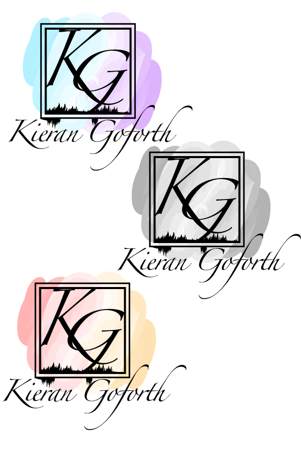
For my first name logo design I wanted to create a design that explored the use of typography and combining it with a shape that fits together. To create this piece I used a serif font to give the logo a bit of style, the font also adds a sense of me personally as style is something I’m interested in more notably fashion and shoes so this font was used to represent that. I surrounded my initials in the square/ box as the box slightly looks like a set off goal posts which was done to reference my liking to the sport of football again giving an insight of my personal joys, I also added the grass inside the box to further reinforce that fact. I then used the brush tool in illustrator and added a wave/ stroke of oil paint along the logo to give it a bit of colour and energy and bring the logo to life, this was done to also reference my joy for art and graphic design. The choice to use this font was to also further link to me as an artist as the font looks calligraphic and calligraphy is usually associated with art so I used this to further express who I am as a person. The choice to design it all in black and one single colour was so that there was a contrast from the background colour of the oil paint, therefore making it clear and easy to read. I decided to connect most of the logo together such as the initials inside the box and made them overlap so that the logo joins together as a whole and so that none of it looks as though it is just floating there so that if it were to be made as a 3d model for example it could be made without falling apart with my full name been the exception.
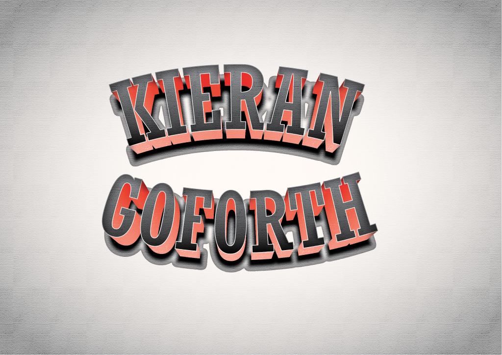
With this name logo I experimented a lot more using a lot more tools within illustrator to create a more detailed approach. To create this piece I edited the typography by using the appearance tool within illustrator to change the actual appearance of the text by adding things such as shadow, gradient blur and more and then by warping the image to give it the curved effect that I have to make it look as though it is wrapped around a point with room to write something in the middle if I wished too. I then added a filter on the top of the piece to make it look as though it is printed on some old piece of paper. My overall aim of this logo was to create one that looked as though it is retro, more notable from the 80s or 90s. To reinforce this look I used a popular and similar font to what was heavily used in those times in things such as football shirt printing and fashion on things such as hoodies and sweaters which is something I like- retro looking clothing and football shirts. I decided to make the logo large and bold to make it easily recognisable and also easy to read, the colour scheme I used was of those of my favourite football team which is Manchester United and their colours been red, black and white. I created this logo with the intention and idea that it could be put on things such as clothing or used on a circular sign used for something such as a shop or a social media page or even just as it currently is and printed as a poster on paper and framed and could be used to hang in a house somewhere.
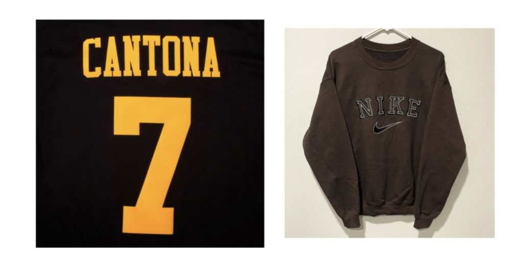
https://www.subsidesports.com/uk/cantona-7-retro-flock-printing-94-95-man-utd-away (source for the Cantona image)
https://www.pinterest.co.uk/pin/vintage-mocha-brown-nike-sweatshirt-in-2021–1133992381143123434/ (source of the Nike sweatshirt image)