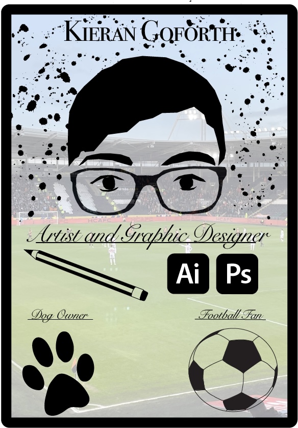
For my two self promoting images I wanted to take two completely separate approaches. For this first design I decided to go with a more simple and clean design in a way that tells a lot about me as a person and as an artist/ designer. The choice to use two different fonts was done to separate the two and highlight the part that is more important and the other slightly less, so the font used for my name is a serif font (as is the other font) but is a lot bolder than the other which highlights it that bit more, this is so my name can be highlighted to the viewer so that they know who it is they’re looking at. The other font been in a more “fancier” looking serif font is used as it looks more loose and wavy which links to the stroke of a pen/ pencil further highlighting what I am promoting of myself (art and graphic design). To add more decoration to the poster I drew out a few 2D logos and items to show my interests, strengths and some of the things I use, this was done using mostly the pen tool. The reason to add in extra information such as the “dog owner” and “football fan” was so the viewer knows a bit about me on a more personal level, so that if it was for example a customer/ client who was viewing this they would know that extra bit about me and could lead to a better bond/ relationship with them. I added a photo in the background of my local football team and one of their games as football is a big part of my life and is where I spend the majority of my weekends, watching football. This is also added to signify that something I look to be doing in the near future is to potentially use my skills in the sport industry someday. I added the rounded border around the piece to give it the look of a business card, something that I can hand out, however most business cards are usually in a horizontal format so I wanted to go against the norm and create a vertical one.
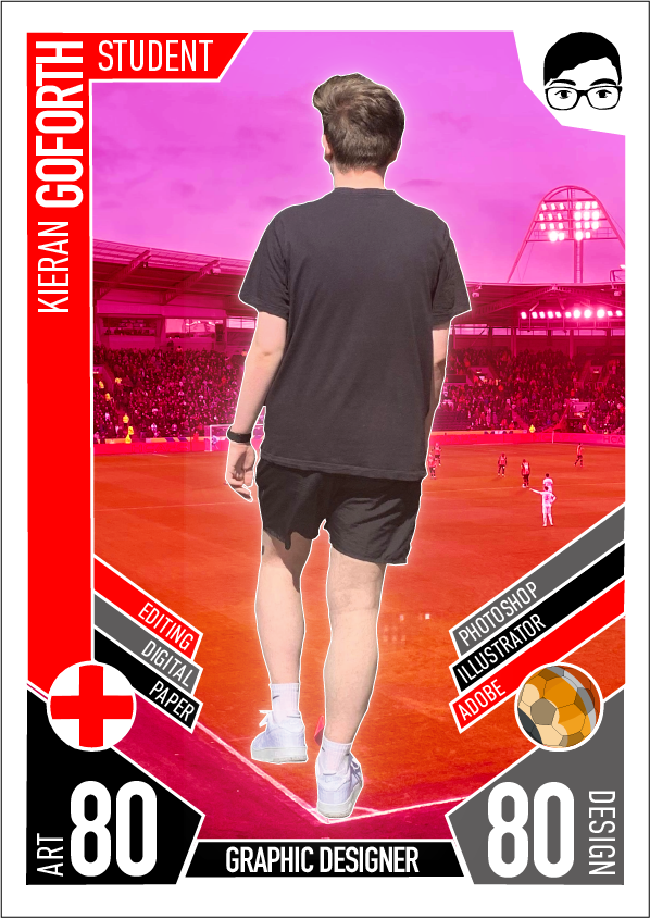
For this second poster I took a completely different approach and created a slightly more complex poster, this poster was made using a mixture of both photoshop and illustrator. This poster I created to look like a football card, or better known as “match attax” which is something I used to collect when I was younger. I designed it using the colours of the football team I support (Manchester United) and replaced many things within the card to promote me as an artist and graphic designer rather than a footballer. I started by replacing the stats with the things I use as a designer and artist and also added a few of my traits and also tried to keep it relevant to a “match attax” card by keeping a rating of both my artistic skills and my design skills (80/ 100). I designed the card so that it was compositionally symmetrical keeping it exactly the same on both sides of the card towards the bottom so that nothing looks as though it was placed randomly, and also helps separate the card into sections. I used a san serif bold font as typically that is the type of font used within something sport related and also looks sharp which is an aspect you would expect in a sportsman or sport as a whole. In the centre of the piece I added a photo of myself to further highlight that I am the person the poster is about with my name on the left and “student” to further highlight the stage I am currently in my life. The choice to create it in the format of a football card was again to promote in the future something I aim to be doing is to be using my design skills within the sporting industry. The background image is the same image used in the first poster, however I changed the hue of the image in photoshop to red to keep it relevant to my chosen colour scheme.