Composition Work.
Im simple terms composition is the process in which all the separate elements in a piece come together to form a whole piece whilst keeping the design clear and easy to recognise. It is the ability to lay out everything on a blank page in a fashionable way, in a way that makes the overall piece tell a story or to visually communicate a message.
Good Use of Composition.
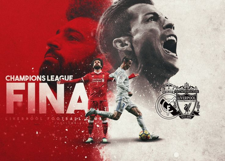
This is a poster made for the Champions League final between Liverpool and Real Madrid.
In my opinion there is a good use of composition within this poster, as all the separate elements within the piece have been put together clearly and effectively so that each element shows its own message. To begin with, the obvious main highlight of the piece is the two players (Ronaldo and Salah) the artist has shown this by placing the both of them in the centre of the piece and then also adding an enlarged image of the two of them. This has been done to signify that these are the main players on both teams and they are the ones to watch, this also may have been done to show that these are the two that will be going to battle to prove who is the better out of the two. The artist has also effectively filled in the negative space around the piece by filling it with the two main colours of the teams, white been Real Madrid and red been Liverpool, this helps identify both of the teams even more. The artist has made it look as though the colours are clashing together in the centre to further signify the clash between the two clubs. Finally, to the left of the piece the artist has used a san serif bold font that is clear and easy to read to show what the poster is originally for (the Champions League final) however, although the word “final” is missing the letter “L” to some this may be obvious what it’s meant to say to others it may not be, which is one improvement that could be made. On the right is the badges of the two clubs, the artist has made a black outline of each to help contrast against the background making it clear to read. Overall the poster comes together to show a clash between two prestigious clubs in world football and to show how the match is going to be one for the history books and not to be missed.
Poor Use of Composition and My Redesign.
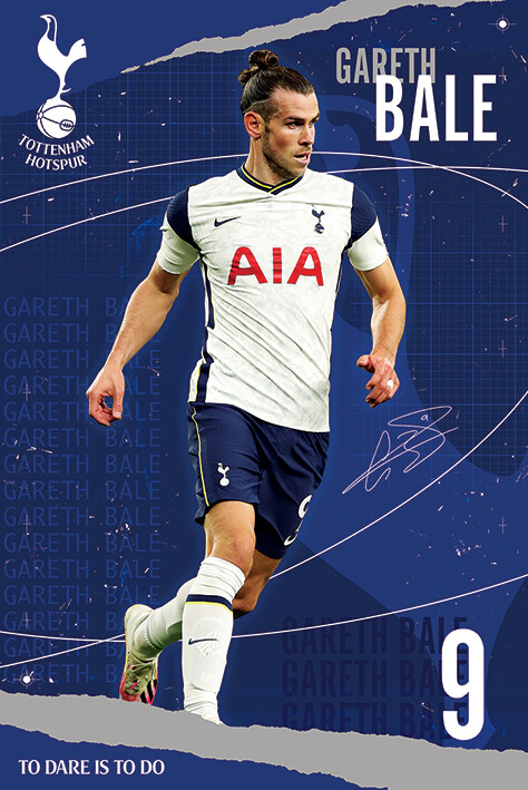
This is a playing card for the player Gareth Bale.
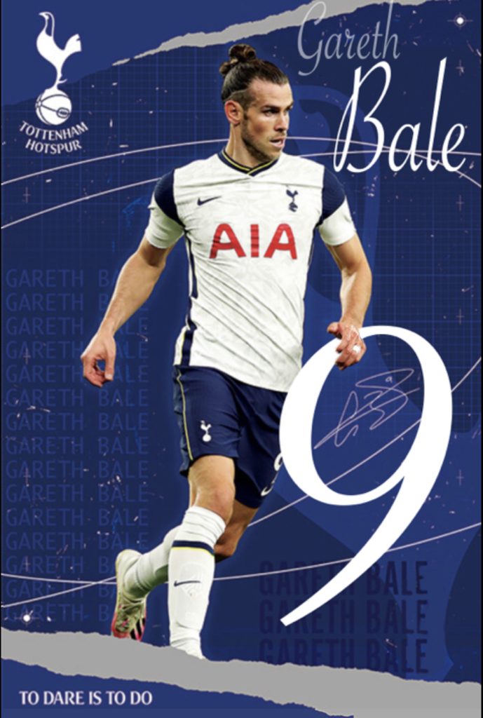
In my opinion this is a bad use of composition, as while the main focus is the player which is shown clearly within this piece by it been enlarged and placed in the centre, the rest has just been thrown into the corners of the artwork, and it isn’t clear what the secondary focus is within the piece and so on. The first thing I did within my redesign of the poster was remove the original writing of the players name and number and replaced the font and changed the locations of where they are on the poster. The first change I made was the number, firstly I changed the size of the number and made it much larger, the purpose of this is because usually if someone can’t see the name of a player or don’t recognise who it is they usually look for the number, so I enlarged it to make it the secondary focus of the poster for those people. I also positioned the number so that the bowl within the number 9 has the players signature within it, I did this to create the effect that the ’9’ is circling the signature to help highlight and identify it as a signature a bit more easily, as before it slightly blended in with the background decoration. I also enlarged the players name and changed the font to a serif font. I did this as in my opinion the font I chose fits in with the lines and decoration around the poster whilst also remaining clear and easy to read, also I feel the font been more ”fancy” can help show how this is one of the better players within the game of football.
Link for first poster: https://pin.it/6z5QcRS
Link for second poster: https://www.iposters.co.uk/tottenham-hotspur-gareth-bale-poster