Colour Work.
Good Use of Colour.
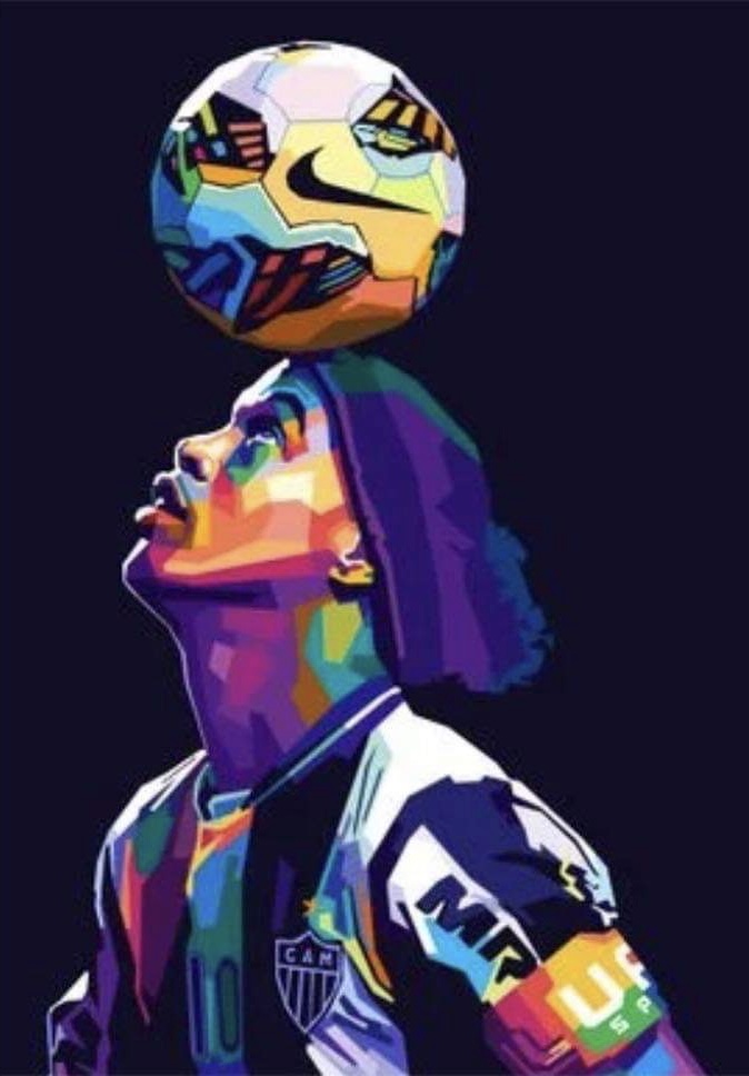
Poster of Brazilian football icon Ronaldinho.
In my opinion this is a good use of colour for multiple reasons. To begin with the colours used are all bright and vivid which give off an exciting vibe and gives the poster a feel of energy coming from it which is something you should feel when attending a football game. Furthermore, this could be done to symbolise the type of player Ronaldinho was- a player who was very skill-full, electric and exciting on the ball and always had the crowd on their feet, which the bright colours help give those emotions. Also the colours chosen are quite effective as they give quite a Brazil like feel to it as it kind of reminds you of the favelas you seen within Brazil with the bright multi coloured houses/ homes dotted around Brazil, which may have been done intentionally to show where Ronaldinho originated from. With the colours linking to Brazil, it also helps to signify the footballing community within the streets of Brazil, further signify Ronaldinho’s upbringing and where he came from, helping tell a short story of the player. Having the background in a dark colour creates a big contrast within the poster that helps highlight the player even more, this could have been done to signify what it was like to watch Ronaldinho, showing how he was always the highlight on the field and anyone in the background were in his shadow as no one could ever reach the level he was at and never had the ability that he had. The artists choice of bright and vivid colours is also effective as you could argue that it captures and resembles the feelings and emotions you get when you go to play and watch football, showing how it can be an escape for a lot of people around the world, an escape from reality or things they have going on in their life.
Poor Use of Colour.
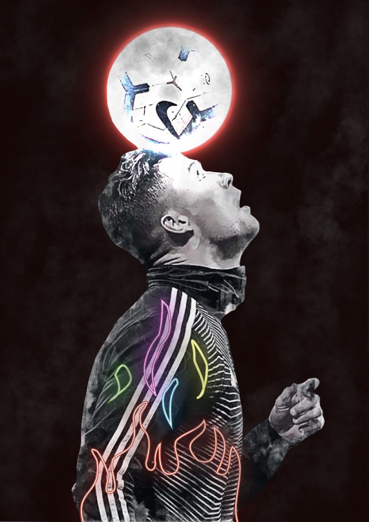
I thought this was a poor use of colour for the simple fact that there wasn’t really any colour used so there wasn’t really any message you could see from the piece. My main aim within my redesign was to integrate more colour within the piece whilst also sending a message about what football can do and bring out in people. The first thing I decided to do was add a darker background to create a contrast and help isolate the player a bit more and also the ball as before it slightly blended in with the background. I added a neon like light around the ball using the colour red, the use of red was to symbolise the colour of Manchester United which is the club the player plays for and the main colour of that team. The idea to include the colour in the form of light and the use of the dark background also was to show how football can help bring light and positivity to those who may be struggling in darker and tough times. Finally, I decided to add multiple bright, vivid colours within the player, I did this to help show the emotions you feel whilst playing football, happiness, excitement and more, usually bright colours are used to portray more uplifting emotions and dark more dull are used for the opposite. I added these colours in the form of a flame to signify the flame that can be ignited when playing football, and how it can make a person hungry to keep playing and watching more, and usually when a flame starts, when added to it, it can grow larger and larger, so I added the flame to also show how the more you play football the more you may begin to love it, growing your emotions more and more, making those colours and emotions within you even more brighter and bigger.
Link for first poster: https://displate.com/displate/4889688
Link for second poster: https://displate.com/displate/3253957