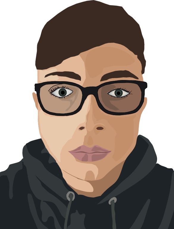
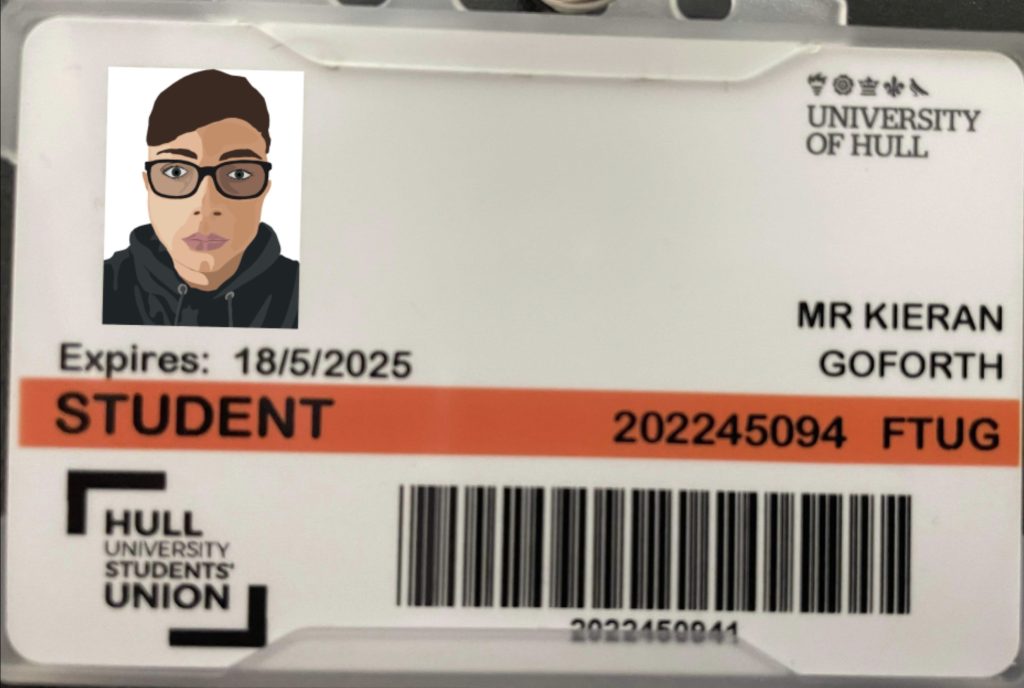
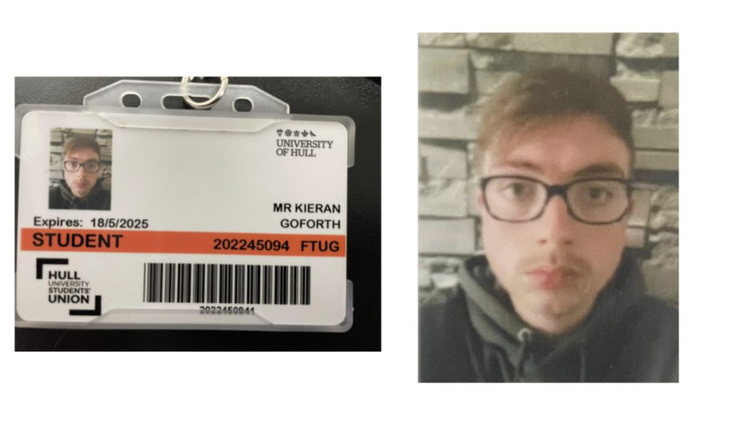
With my two illustrator portraits I had the idea of making the one piece a bit more basic than the other and the other been a lot more detailed and more complex. With this first piece my idea was to create a piece but with fewer shapes and fewer tones used, but at the point where it still has enough depth so that it doesn’t look just like a flat 2D portrait. My idea was to create something basic but still had some value to it, so my thought was to use the photo on my university card as it was a simple straight faced portrait of myself however had a lot of meaning to it as it is the photo on my university card which is going to be a bit part of my life for the next 2.5- 3 years. With this piece I tried to stick with two tones on each area, for example, on the hoodie part there is simply just a dark green to represent the shadows on the hoodie and then a lighter green to show where the light is hitting it, and the same for the rest of the piece. However the face/ skin required a few more tones to give it some tonal depth and to avoid it looking flat and to help give it some structure. To create this piece I used a lot brighter tones than the ones in the original photo so that the portrait didn’t look dull or moody in any way as I didn’t want that to reflect me as a person as that isn’t the type of person I am, so I made it brighter to give it a bit more life and to give it a lot more energy overall.
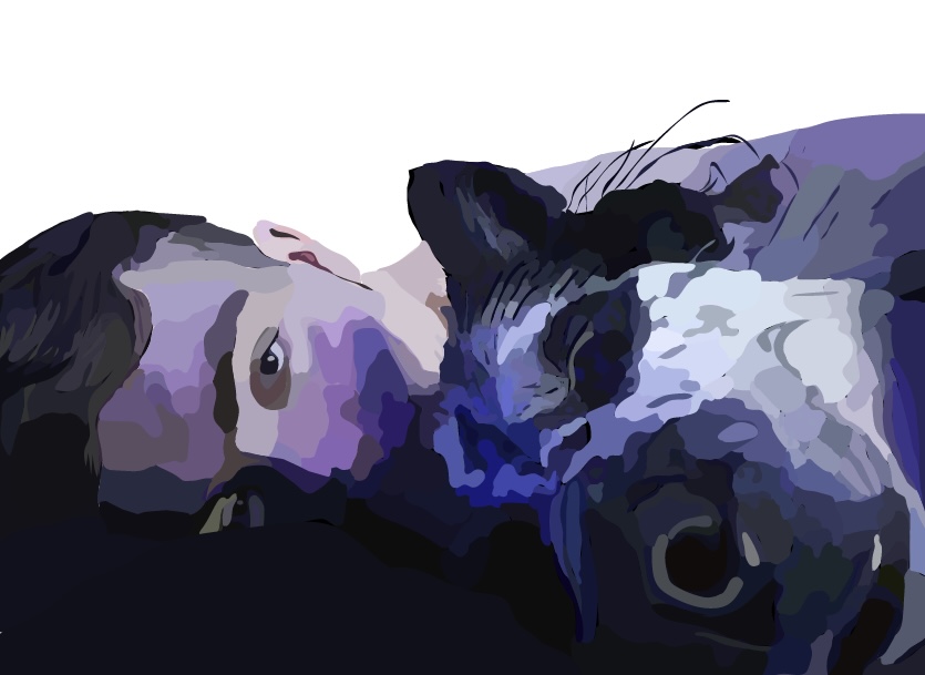
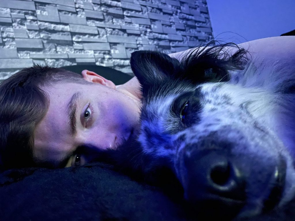
With this second piece I wanted to create a portrait that was slightly more unusual and used unlimited tones and shapes and shape sizes so that there were no restrictions when making this piece, allowing it to be a lot more detailed and have a lot more depth within it. For this piece I chose to create a portrait that had a lot more meaning to me so I chose this picture of me and my dog storm. I chose this picture due to the unusual tones as the reflections on my face and also the white fur on my dog, as it allowed me to use colours like blues and purples, allowing me to create a quite unique looking portrait. I created this portrait using a lot smaller shapes so that it allowed me to be a lot more precise and detailed within the piece and that combined with the hundreds of different tones I used helped to create a portrait that is a lot more defined and has a lot more shape to it. To create the piece I first drew out a basic flat outline of both me and my dog filling my part in a skin colour and my dog in a solid lack colour, I then pile the shapes on top another changing the tones of them as I went along to eventually get to the final result. Overall this piece was made to push myself more as this was my first time creating a big piece like this using illustrator, so I wanted it to signify myself as a artist and/ or as a graphic designer how I am willing to learn and push myself to create better work in the future.